Fig. 4
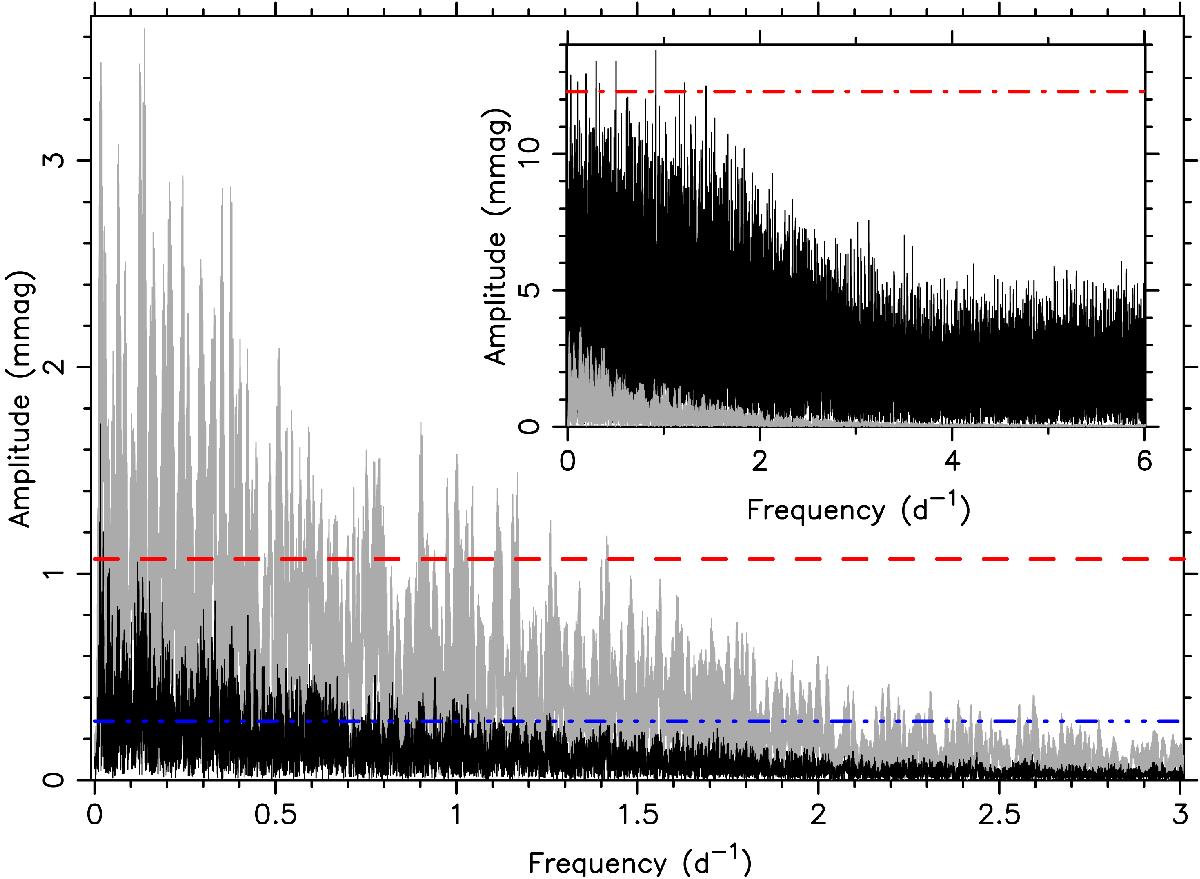
Amplitude spectrum for the Kepler light curves of masks 32 (grey) and 45 (black). The inset compares the spectrum of the Kepler light curve from mask 32 (grey) with the Hipparcos light curve (black) over twice the frequency range. The red dashed and blue dot-dot-dot-dashed lines indicate four times the average noise level computed over the frequency range [0,6] d-1, while the red dot-dashed line in the inset represents four times the average noise level computed over the same range [0,6] d-1 of the Hipparcos data.
Current usage metrics show cumulative count of Article Views (full-text article views including HTML views, PDF and ePub downloads, according to the available data) and Abstracts Views on Vision4Press platform.
Data correspond to usage on the plateform after 2015. The current usage metrics is available 48-96 hours after online publication and is updated daily on week days.
Initial download of the metrics may take a while.