Fig. 3
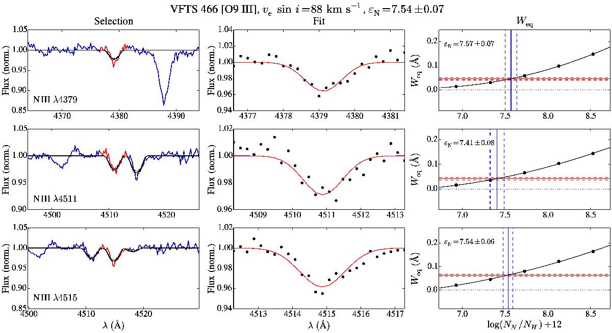
Abundance measurement for VFTS 466, a relatively high S/N source. Not all lines used are shown. Left panels: the observed spectrum is shown in blue and the best model fit in black. The nitrogen abundance of the best model resulted from combining all utilised lines and is given by the εN in the figure title. The selection of the fit region is displayed in red. Middle panels: zoom in on the fitted region, with the best fit Gaussian profile in red. Right panels: theoretical Weq values as a function of εN (horizontal axis) are shown in black. Measured Weq and interpolated εN are in red and blue, respectively. Dashed red lines indicate the measurement error and dashed blue lines the corresponding uncertainty in the best fit value.
Current usage metrics show cumulative count of Article Views (full-text article views including HTML views, PDF and ePub downloads, according to the available data) and Abstracts Views on Vision4Press platform.
Data correspond to usage on the plateform after 2015. The current usage metrics is available 48-96 hours after online publication and is updated daily on week days.
Initial download of the metrics may take a while.