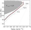
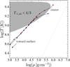
Fig. 2
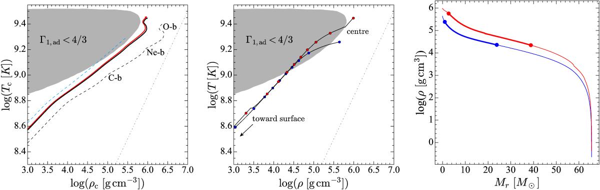
Left panel: evolutionary tracks in the central temperature versus central density diagram. The colours of the tracks have the same meaning as in the top left panel of Fig. 1. The thin grey dot-dashed line represents the transition between the perfect gas and degenerate gas domains. The shaded grey zone shows the region of the diagram where electron-pair creation occurs and is adopted from Chatzopoulos et al. (2015). Centre panel: internal profiles of the magnetic rotating model at the beginning (blue dots) and end (red dots) of central oxygen burning. The dots are spaced by 10% of the total mass of the star. Right panel: internal density profiles (as a function of the mass coordinate) at the beginning (blue) and end (red) of central oxygen burning. The thick part of the curves indicates the region inside the star inside the electron-pair creation region.
Current usage metrics show cumulative count of Article Views (full-text article views including HTML views, PDF and ePub downloads, according to the available data) and Abstracts Views on Vision4Press platform.
Data correspond to usage on the plateform after 2015. The current usage metrics is available 48-96 hours after online publication and is updated daily on week days.
Initial download of the metrics may take a while.