Fig. 14
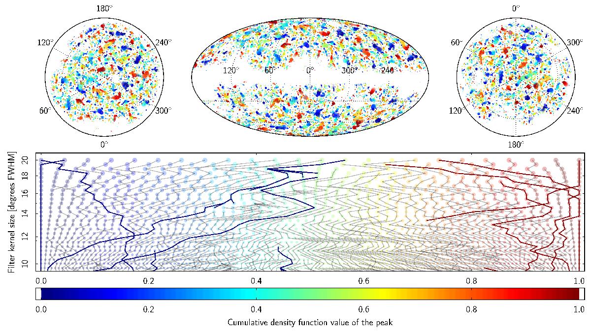
Peak positions and CDF rank summarized for all filtering scales. The three sky-view panels in the top row show a Lambert projection of the north pole, the usual full sky Mollweide projection, and a Lambert projection of the south pole. The lower panel shows the peak heights (in percentile of the peak distribution on the horizontal axis) as a function of filter scale (on the vertical axis, in logarithmic scale), truncated to larger scales for clarity. Circles represent peaks (nodes of the graph) coloured according to their percentile level, and scaled according to kernel size. Black lines represent edges connecting peaks at different scales (according to a minimal distance measure). The components connected to the coldest and hottest peaks at any scale are highlighted by thicker edges, and are navy blue and dark red in colour. Note that there are thick lines that do not touch the 0 and 1 percentiles in the plot view. Those edges are connected to extreme percentile values, but at scales smaller than those shown in the plot. The Cold Spot is represented by the connected nodes that have the smallest percentiles except for the coarsest scale in the plot view.
Current usage metrics show cumulative count of Article Views (full-text article views including HTML views, PDF and ePub downloads, according to the available data) and Abstracts Views on Vision4Press platform.
Data correspond to usage on the plateform after 2015. The current usage metrics is available 48-96 hours after online publication and is updated daily on week days.
Initial download of the metrics may take a while.