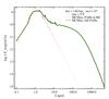
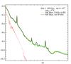
Fig. A.3
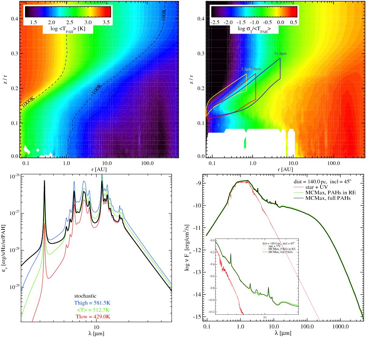
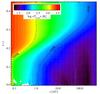
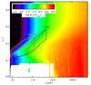
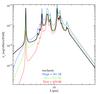
Comparison of PAH results between full treatment with stochastic quantum heating, and simplified method assuming the PAHs to be in radiative equilibrium. The reference model with artificially increased PAH abundance fPAH = 10 is considered. The upper left plot shows the mean PAH temperature ⟨ TPAH ⟩, and the upper right plot shows the relative width of the PAH temperature distribution function σT/ ⟨ TPAH ⟩ where ![]() . The coloured boxes on the right encircle the disk regions which emit 50% of the PAH features at 3.3 μ, 7.6 μm and 11.3 μm. In the blank regions, the Monte Carlo statistics is too poor to compute the PAH temperature distribution function p(T). The lower left plot explains how we define Tlow and Thigh by bracketing the local PAH emission coefficient ϵν by two temperatures. The lower right plot compares the SED results obtained with the two different methods using MCMax, with a zoom-in between 2 μm and 30 μm. There is barely any difference.
. The coloured boxes on the right encircle the disk regions which emit 50% of the PAH features at 3.3 μ, 7.6 μm and 11.3 μm. In the blank regions, the Monte Carlo statistics is too poor to compute the PAH temperature distribution function p(T). The lower left plot explains how we define Tlow and Thigh by bracketing the local PAH emission coefficient ϵν by two temperatures. The lower right plot compares the SED results obtained with the two different methods using MCMax, with a zoom-in between 2 μm and 30 μm. There is barely any difference.
Current usage metrics show cumulative count of Article Views (full-text article views including HTML views, PDF and ePub downloads, according to the available data) and Abstracts Views on Vision4Press platform.
Data correspond to usage on the plateform after 2015. The current usage metrics is available 48-96 hours after online publication and is updated daily on week days.
Initial download of the metrics may take a while.