Fig. A.1
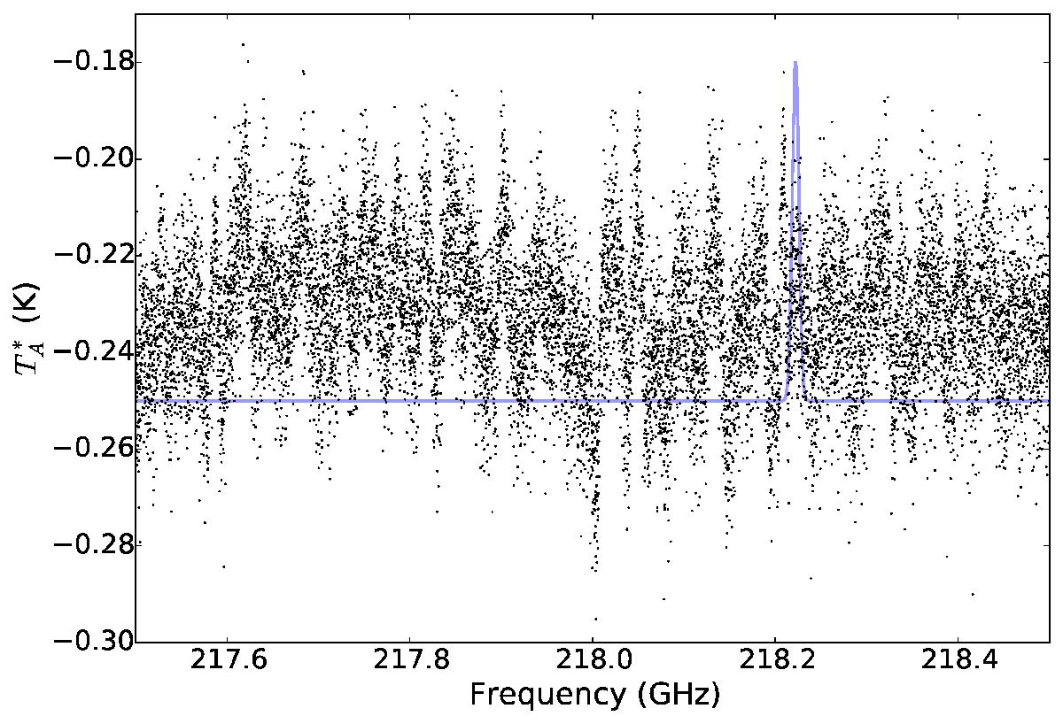
An example showing some of the worst baselines observed. The plotted spectrum is from an observation on April 2, 2014, showing the average of the 5% worst spectra. The blue curve shows a σ = 5 km s-1 (FWHM = 11.75 km s-1) line centered at the 0 km s-1 position of p - H2CO30,3−20,2, illustrating that the baseline “ripples” have widths comparable to the observed lines. While we selected the worst 5% in this case, nearly all spectra are affected by these sorts of baselines, and the shape and amplitude varies dramatically and unpredictably. The variation, unpredictable though it is, works in our favor as it averages out over multiple independent observations. The 218 GHz region shown here is also the worst-affected; the 220 GHz range that includes the 13CO lines generally exhibits smoother and lower-amplitude baseline spectra.
Current usage metrics show cumulative count of Article Views (full-text article views including HTML views, PDF and ePub downloads, according to the available data) and Abstracts Views on Vision4Press platform.
Data correspond to usage on the plateform after 2015. The current usage metrics is available 48-96 hours after online publication and is updated daily on week days.
Initial download of the metrics may take a while.