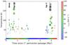
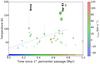
Fig. 15

Observed temperature vs. time since the most recent pericenter passage of The Brick and the dust ridge clouds on the Kruijssen et al. (2015) orbit for dendrogram-extracted clumps within 35 km s-1 and 12 pc of the orbital path. a) shows the entire orbit while b) shows an expanded view of the first Myr. The colored bar along the bottom of the figure shows the modeled orbit velocity at each position. In both panels, the darker symbols represent “leaves” in the dendrogram structure, i.e. compact clumps, while the fainter symbols represent their parent structures. There is a hint of an increase in temperature with time, from an initial temperature TG ≲ 50 K to TG ≳ 100 K over a period τ ~ 0.8 Myr, as illustrated by the dashed line in panel b); note that the cool features from 0.7–0.9 Myr are at a significantly different velocity and therefore cannot be part of the same stream. The Brick is an outlier (it is hotter) whether or not there is a trend. The symbol sizes are proportional to the p - H2CO32,1−22,0 brightness and are meant to give an indication of how reliable the temperature measurements are. The gray vertical lines through the circles indicate the formal 1σ errors on the temperature.
Current usage metrics show cumulative count of Article Views (full-text article views including HTML views, PDF and ePub downloads, according to the available data) and Abstracts Views on Vision4Press platform.
Data correspond to usage on the plateform after 2015. The current usage metrics is available 48-96 hours after online publication and is updated daily on week days.
Initial download of the metrics may take a while.