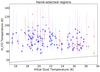
Fig. 12
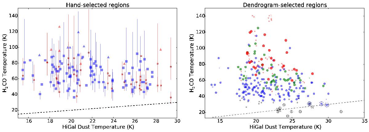
a) Fitted temperature of region-averaged spectra as described in Sect. 4.2 plotted against the HiGal fitted dust temperature. As in Fig. 9, the blue symbols are compact “clump” sources and the red symbols are large-area square regions. The black dashed line shows the TG = TD relation. Nearly all of the data points fall above this relation, and very few are consistent with it at the 3σ level. b) Same as a) but for the dendrogram-extracted sources, showing a similar discrepancy between dust and gas temperature. The points are color coded by signal-to-noise in the ratio R1, with gray S/N< 5, blue 5 <S/N< 25, green 25 <S/N< 50, and red S/N> 50.
Current usage metrics show cumulative count of Article Views (full-text article views including HTML views, PDF and ePub downloads, according to the available data) and Abstracts Views on Vision4Press platform.
Data correspond to usage on the plateform after 2015. The current usage metrics is available 48-96 hours after online publication and is updated daily on week days.
Initial download of the metrics may take a while.