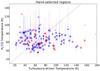
Fig. 10
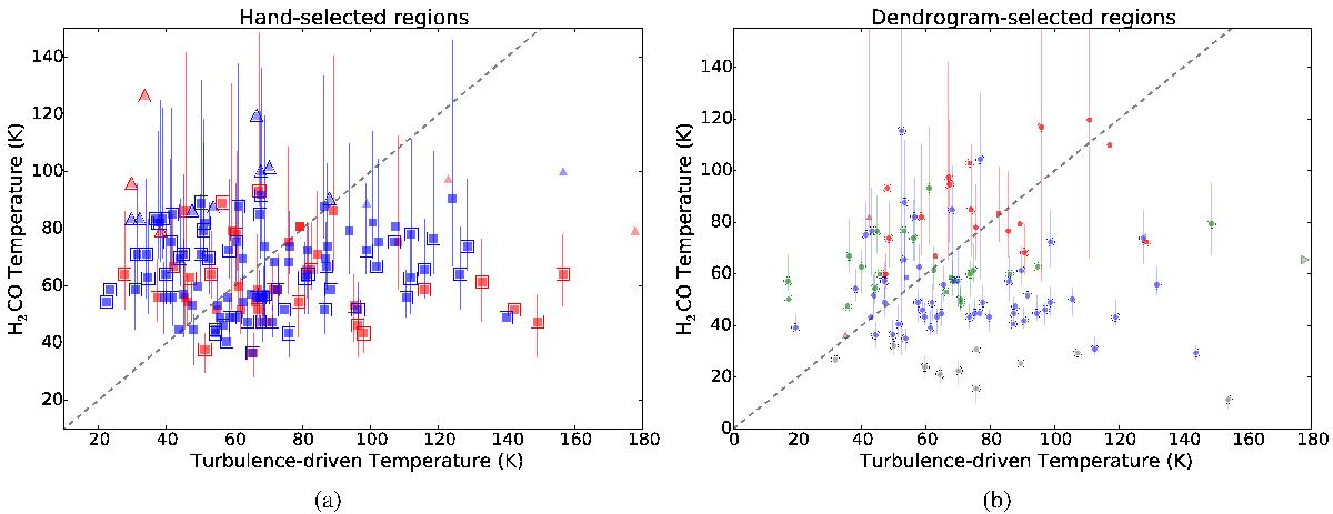
p - H2CO-measured temperature against the predicted turbulent-driven temperature as discussed in Sect. 5.1. While no trend is obvious in the data, most of the high signal-to-noise data points are fairly close to the TG,turb = TG,measured line. There are few points with TG,measured>TG,turb, so turbulence generally provides enough – and sometimes too much – energy to heat the gas to the observed temperatures. The regions with predicted temperatures higher than observed require additional explanation: either their heating rate has been overestimated or their cooling rate underestimated. a) The hand-selected regions as described in Fig. 12; the blue symbols are compact “clump” sources and the red symbols are large-area square regions. Triangles indicate regions with lower limits on the measured temperature, i.e. any region with a measured 1−σ lower limit on the temperature TG> 150 K. The gray dashed line shows the TG,turb = TG,measured relation. Regions that are inconsistent with the relation at the 1−σ level are outlined. b) The same as a) for the dendrogram-extracted regions. Regions with a large Gaussian correction factor fg> 3 are excluded. Regions with TG,turb> 180 K are indicated with triangles. The points are color coded by signal-to-noise in the ratio R1, with gray S/N< 5, blue 5 <S/N< 25, green 25 <S/N< 50, and red S/N> 50. If the lower signal-to-noise points in blue and gray are ignored, the agreement between the predicted temperature and observed temperature is fairly good.
Current usage metrics show cumulative count of Article Views (full-text article views including HTML views, PDF and ePub downloads, according to the available data) and Abstracts Views on Vision4Press platform.
Data correspond to usage on the plateform after 2015. The current usage metrics is available 48-96 hours after online publication and is updated daily on week days.
Initial download of the metrics may take a while.