Fig. 3
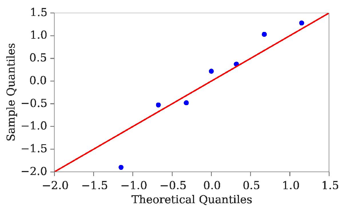
Quantile-quantile plot as a test for normality. An average over 100 pixels in the central regions where the continuum is assumed to be relatively flat is used. The inverse cumulative distribution for the sample is constructed and plotted against the corresponding quantiles for a normal distribution. The red line arises if we are sampling for a normal distribution. Since the points are slightly steeper, this indicates a more dispersed distribution.
Current usage metrics show cumulative count of Article Views (full-text article views including HTML views, PDF and ePub downloads, according to the available data) and Abstracts Views on Vision4Press platform.
Data correspond to usage on the plateform after 2015. The current usage metrics is available 48-96 hours after online publication and is updated daily on week days.
Initial download of the metrics may take a while.