Fig. B.1
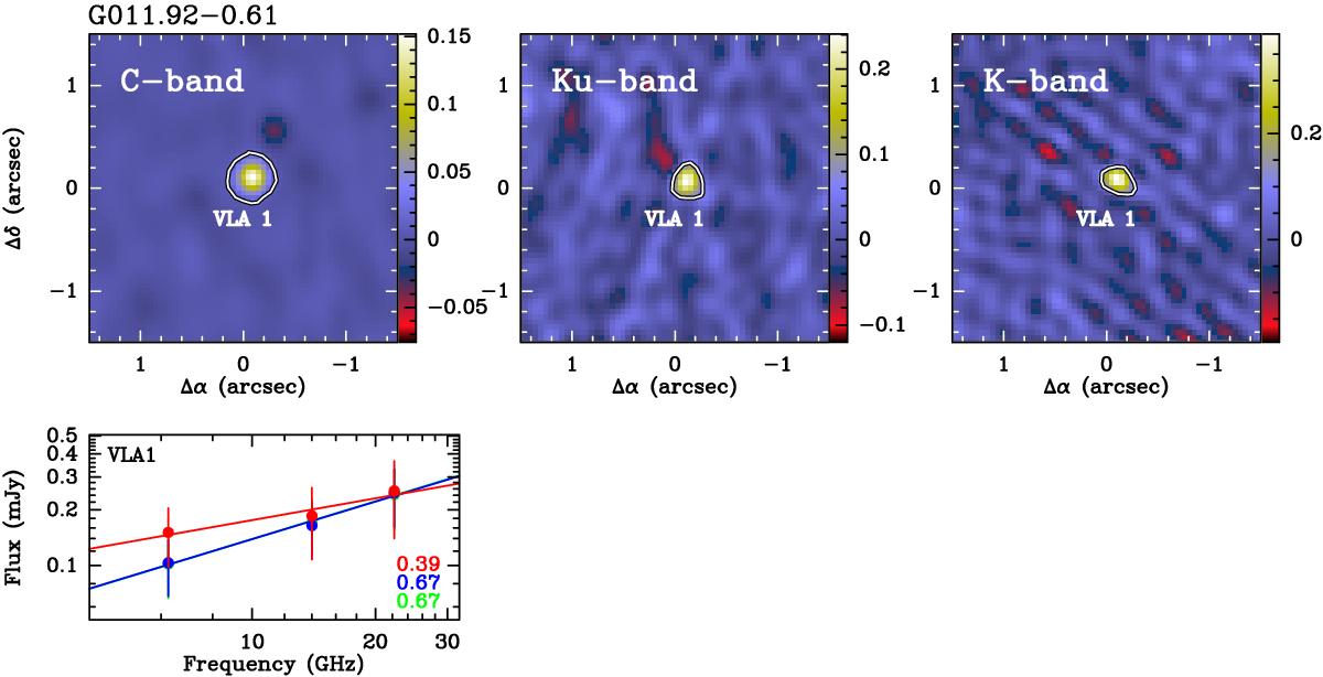
Upper panels: continuum images at the observed frequencies, from C to K-band moving from left to right. The target to which images and plots refer is indicated in the upper left of the figure. Images at different frequencies are reconstructed using a common, reduced uv-coverage, as described in Sect. 3.1. The field of view is centered on the observed (water maser) position reported in Table 2. In each image, the detected components are marked with polygons at the 3σ contour level, and if multiple components are observed, the corresponding polygons are labeled with increasing integer numbers. Lower plots: flux density distribution for each detected component. Red, green and blue colors indicate whether the fluxes have been computed from a polygon defined in the C-band, Ku-band, or K-band image, respectively. At a given frequency, either a dot or an arrowis used to denote if the component has been effectively detected at that particular frequency band or if the derived flux is only an upper limit. The solid line shows the linear fit performed over the whole observed frequency range, with the line color identifying the measurements considered to perform the fit. The fit slope, i.e., the spectral index, is indicated by the colored numbers reported in the lower right corner of the plot, with color denoting the corresponding linear fit.
Current usage metrics show cumulative count of Article Views (full-text article views including HTML views, PDF and ePub downloads, according to the available data) and Abstracts Views on Vision4Press platform.
Data correspond to usage on the plateform after 2015. The current usage metrics is available 48-96 hours after online publication and is updated daily on week days.
Initial download of the metrics may take a while.