Fig. 4
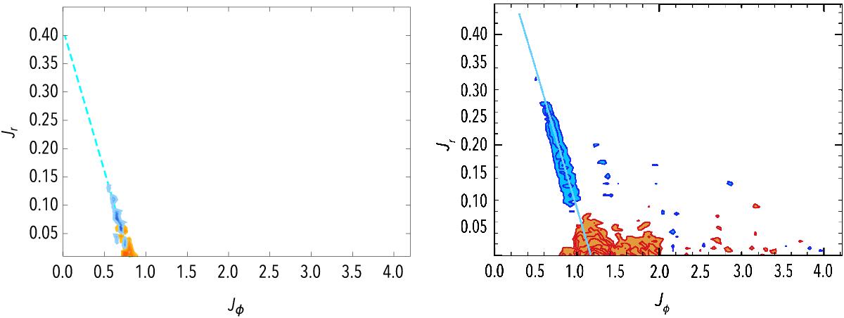
Left panel: map of Ndiv(ℱtot), where the total flux has been computed with m1,m2 ∈ {mILR,mCOR,mOLR}. Red contours, for which Ndiv(ℱtot) < 0 are associated with regions from which the orbits will be depleted, whereas blue contours, for which Ndiv(ℱtot) > 0 correspond to regions where the value of the DF will be increased during the secular diffusion. The contours are spaced linearly between the minimum and the maximum of Ndiv(ℱtot). The maximum value for the positive blue contours corresponds to Ndiv(ℱtot) ≃ 350, while the mininum value for the negative red contours is associated with Ndiv(ℱtot) ≃ −250. Right panel: from Sellwood (2012) – Fig. 7, contours of the change in the DF between the time tS12 = 1400 and tS12 = 0, for a run with 50M particles. Similarly to the left panel, red contours correspond to negative differences, i.e. regions emptied from their orbits, while blue contours correspond to positive differences, i.e. regions where the DF has increased during the diffusion. Both of these contours are aligned with the ILR direction of mILR = (2,−1) in the (Jφ,Jr)-plane, corresponding to the cyan line.
Current usage metrics show cumulative count of Article Views (full-text article views including HTML views, PDF and ePub downloads, according to the available data) and Abstracts Views on Vision4Press platform.
Data correspond to usage on the plateform after 2015. The current usage metrics is available 48-96 hours after online publication and is updated daily on week days.
Initial download of the metrics may take a while.