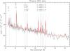
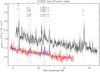
Fig. 6

Top panel: combined RGS 1 and 2 spectrum for the Phoenix cluster and best-fit single-temperature model. The data have been rebinned to have a signal-to-noise ratio of 10 and divided by the effective area of the instrument only for displaying purpose. Relevant lines are also labeled. Bottom panel: The Phoenix spectrum (in red) is compared with the RGS spectrum of Abell 1835 (in black). We plot the fluxed spectra obtained with RGSFLUXER. Similar results are obtained by plotting the unfolded spectrum in XSPEC (the green line in the Phoenix spectrum) wit the only difference set by the binning condition S/N = 10. The best-fit thermal model of the Phoenix is also plotted as a blue line. We also plot relevant lines clearly seen in the spectra: the same sets of lines are present in both spectra in the overlapping wavelength range.
Current usage metrics show cumulative count of Article Views (full-text article views including HTML views, PDF and ePub downloads, according to the available data) and Abstracts Views on Vision4Press platform.
Data correspond to usage on the plateform after 2015. The current usage metrics is available 48-96 hours after online publication and is updated daily on week days.
Initial download of the metrics may take a while.