Fig. 11
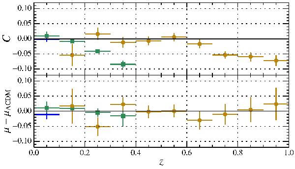
Top: average color of the samples in redshift bins. The low-z (blue crosses), the SDSS-II (green squares) and the SNLS (orange circles) samples are binned separately. The plot provides a visual assessment of the selection bias affecting each survey. Bottom: residuals from the ΛCDM fit of the JLA Hubble diagram as a function of redshift. The different surveys are shown separately.
Current usage metrics show cumulative count of Article Views (full-text article views including HTML views, PDF and ePub downloads, according to the available data) and Abstracts Views on Vision4Press platform.
Data correspond to usage on the plateform after 2015. The current usage metrics is available 48-96 hours after online publication and is updated daily on week days.
Initial download of the metrics may take a while.