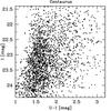
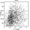
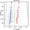
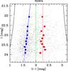
Fig. 5

Colour–magnitude diagrams of the final GC samples for Centaurus (left) and Hydra (right). The individual data points in the top and bottom plot are the same. In the bottom plots additional filled circles in blue and red indicate the median colours between the black limiting curves at extreme colours and the (green) fixed dividing line between the blue and red peak. The blue and red lines indicate least squares fits to the median colours as a function of magnitude.
Current usage metrics show cumulative count of Article Views (full-text article views including HTML views, PDF and ePub downloads, according to the available data) and Abstracts Views on Vision4Press platform.
Data correspond to usage on the plateform after 2015. The current usage metrics is available 48-96 hours after online publication and is updated daily on week days.
Initial download of the metrics may take a while.