Fig. 10
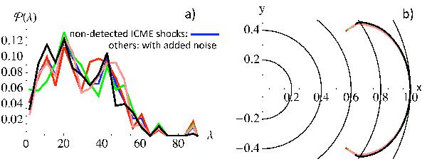
a) Probability distributions  for shocks in front of ICMEs (to be superposed, they are drawn with curves rather than
with a histogram as in Fig. 4). The blue curve,
which is mostly hidden here but better shown in Fig. 11a, is the observed distribution. The other curves are four examples of
adding statistical noise to the observed distribution (see Sect. 4.2). b) Corresponding deduced shock shapes from Eqs.
(15) and (16) with the apex distance,
ρmax, normalized to 1 and
ϕmax =
35° (see Fig. 7
for the parameter definition).
for shocks in front of ICMEs (to be superposed, they are drawn with curves rather than
with a histogram as in Fig. 4). The blue curve,
which is mostly hidden here but better shown in Fig. 11a, is the observed distribution. The other curves are four examples of
adding statistical noise to the observed distribution (see Sect. 4.2). b) Corresponding deduced shock shapes from Eqs.
(15) and (16) with the apex distance,
ρmax, normalized to 1 and
ϕmax =
35° (see Fig. 7
for the parameter definition).
Current usage metrics show cumulative count of Article Views (full-text article views including HTML views, PDF and ePub downloads, according to the available data) and Abstracts Views on Vision4Press platform.
Data correspond to usage on the plateform after 2015. The current usage metrics is available 48-96 hours after online publication and is updated daily on week days.
Initial download of the metrics may take a while.