Fig. 4
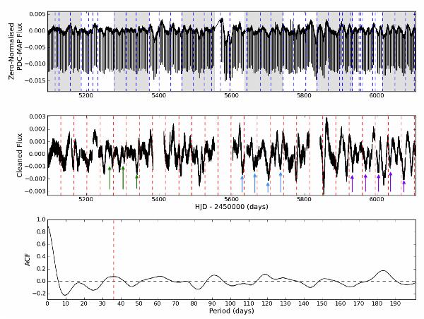
Upper panel. PDC-MAP LC light curve of Kepler-77, with the location of known instrumental systematic features marked by blue dashed lines. Grey and white bands denote the zero-normalised Q3–Q13 data. Middle panel. Cleaned and zero-normalised light curve, following subtraction of the best-fitting transit model. Rotational period intervals are shown with red dashed lines. The arrows mark groups (per colour) of repeated features. Lower panel. Autocorrelation function (ACF) of the cleaned and zero-normalised light curve. The red dashed line marks the peak corresponding to the 36-day rotational period of Kepler-77.
Current usage metrics show cumulative count of Article Views (full-text article views including HTML views, PDF and ePub downloads, according to the available data) and Abstracts Views on Vision4Press platform.
Data correspond to usage on the plateform after 2015. The current usage metrics is available 48-96 hours after online publication and is updated daily on week days.
Initial download of the metrics may take a while.