Fig. 7
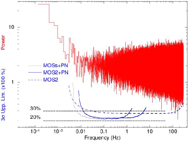
In the upper part of the plot we show the power spectrum produced using the MOS2 event list as an example. In the bottom part of the plot we show the curves representing the upper limits to the non-detection of pulsations calculated according to Israel & Stella (1996). The solid, dashed and dotted lines correspond to the different sampling times and event list combinations discussed in the text. The two horizontal dashed lines represent the 20% and 30% upper limit levels on the pulsed fraction upper limits as a function of the frequency. The most stringent upper limits we could provide are at 20–30% for frequencies in the range 0.005–200 Hz.
Current usage metrics show cumulative count of Article Views (full-text article views including HTML views, PDF and ePub downloads, according to the available data) and Abstracts Views on Vision4Press platform.
Data correspond to usage on the plateform after 2015. The current usage metrics is available 48-96 hours after online publication and is updated daily on week days.
Initial download of the metrics may take a while.