Fig. 2
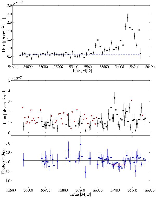
Top panel: monthly aperture photometry light curve for the 0.1−100 GeV band from 2008 Aug. 04 to 2012 Dec. 14. The dashed line represents the background level. Central panel: weekly maximum likelihood light curve in the 0.1–100 GeV band, from 2011 Feb. 01 to 2012 Dec. 14. Downward triangles represent upper limits. Bottom panel: time evolution of the photon index; solid lines represent the mean value over the entire interval (black line) and during the flare (red line).
Current usage metrics show cumulative count of Article Views (full-text article views including HTML views, PDF and ePub downloads, according to the available data) and Abstracts Views on Vision4Press platform.
Data correspond to usage on the plateform after 2015. The current usage metrics is available 48-96 hours after online publication and is updated daily on week days.
Initial download of the metrics may take a while.