Fig. 4
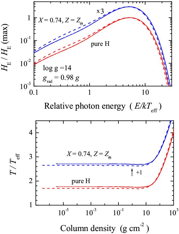
Comparison of the emergent spectra (top panel) and the temperature structures (bottom panel) of the new (solid curves) and the old (dashed curves) models with the same grad/g. The models are computed for pure hydrogen as well as solar abundance. The models have different effective temperatures, therefore the spectra are normalized to the maximum flux and plotted against the scaled photon energy. For clarity, the spectra of solar abundance models are shifted by a factor of three, and the relative temperatures are shifted by adding one.
Current usage metrics show cumulative count of Article Views (full-text article views including HTML views, PDF and ePub downloads, according to the available data) and Abstracts Views on Vision4Press platform.
Data correspond to usage on the plateform after 2015. The current usage metrics is available 48-96 hours after online publication and is updated daily on week days.
Initial download of the metrics may take a while.