Fig. 16
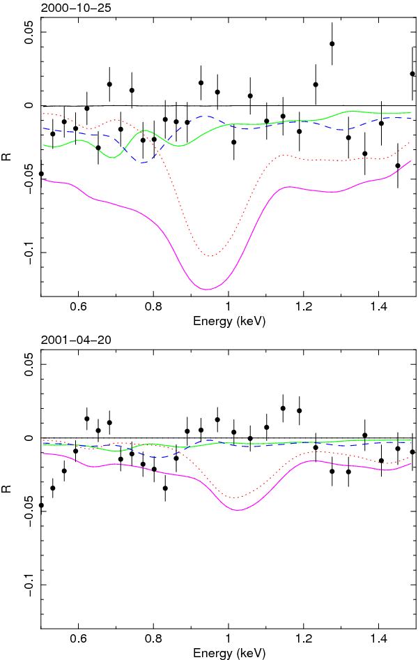
Data points with error bars: observed ratios of the spectra taken in 2000 (upper panel) and 2001 (lower panel) to the average spectrum taken in 2009 in the representation of Eq. (2). We use here realistic continuum models (see text) rather than simplified local power laws as used in Fig. 15 to take out the changes of the continuum. Solid green lines: predicted ratio in the representation of Eq. (3) for ionisation component C; dashed blue lines: same for component D; dotted red lines: same for component E; thick magenta line: components A–E combined. The predictions for components A and B are close to zero and not shown here separately.
Current usage metrics show cumulative count of Article Views (full-text article views including HTML views, PDF and ePub downloads, according to the available data) and Abstracts Views on Vision4Press platform.
Data correspond to usage on the plateform after 2015. The current usage metrics is available 48-96 hours after online publication and is updated daily on week days.
Initial download of the metrics may take a while.