Fig. 3
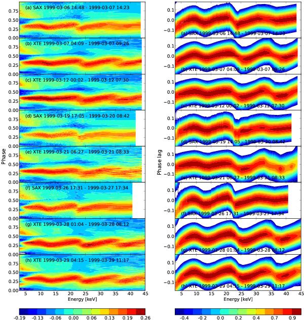
Left panel: pulse profiles extracted from all the observations in Table 1 as a function of energy. Red (blue) colors indicate higher (lower) count rates at different pulse phases and energies. As discussed in Sect. 3.1, the higher intensity is around phase ~0.3, in correspondence with the “main peak”. The pulse profiles in this figure were all scaled to have in each energy bin a zero average value and a unitary standard deviation. Right panel: values of the correlation parameter Ce, as a function of phase lag with respect to the reference pulse profile and energy. Red (blue) colors indicate values of Ce close to unity ( ≪ 1). See text for details.
Current usage metrics show cumulative count of Article Views (full-text article views including HTML views, PDF and ePub downloads, according to the available data) and Abstracts Views on Vision4Press platform.
Data correspond to usage on the plateform after 2015. The current usage metrics is available 48-96 hours after online publication and is updated daily on week days.
Initial download of the metrics may take a while.