Fig. B.1
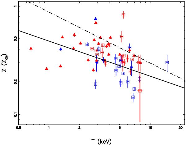
Iron abundance vs. temperature for the 62 clusters. The black line denotes our best power-law fit using the bisector method. The dot-dashed line is the best fit in Balestra et al. (2007) for clusters at higher redshifts (z ≥ 0.3) and in a higher temperature range (3–15 keV). The colors and symbols have the same meaning as those in Fig. 3.
Current usage metrics show cumulative count of Article Views (full-text article views including HTML views, PDF and ePub downloads, according to the available data) and Abstracts Views on Vision4Press platform.
Data correspond to usage on the plateform after 2015. The current usage metrics is available 48-96 hours after online publication and is updated daily on week days.
Initial download of the metrics may take a while.