


Fig. 2.
Download original image
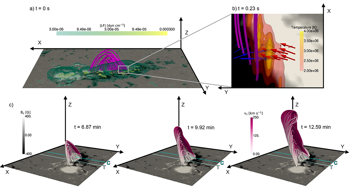
Initialisation and evolution of the eruption at a glance. In all the panels, a magnetogram, with white to black levels, is present in the background to make the link with observations in Fig. 1. The colour map is saturated between −400 and 400 G for visualisation purposes. a) Initial magnetic configuration and Lorentz force at t = 0 s. The pink lines represent the magnetic arcade that was later on transformed into the erupting flux rope. The green to yellow colour map indicates a volumetric representation of the magnitude of the Lorentz force; yellow (green) is more (less) intense. b) Zoom-in at t = 0.23 s of the region defined by the grey rectangle in panel a. The horizontal components of the Lorentz force are shown with arrows in blue (negative) and red (positive), drawn at a height z = 2.2 Mm. Temperature iso-surfaces of 2 × 10⁶ K (red) to 4 × 10⁶ (yellow) are also displayed. c) Rising phase for t = 6.87 min, t = 9.92 min, and 12.59 min. The coloured lines represent the magnetic field lines corresponding to the flux rope. The colour of the field lines represents the vertical speed vz in pink. The two lines in the xy-plane indicate the cuts where the tracking (T line in light turquoise) of the flux rope and the compression (C line in dark turquoise) analysis were performed.
Current usage metrics show cumulative count of Article Views (full-text article views including HTML views, PDF and ePub downloads, according to the available data) and Abstracts Views on Vision4Press platform.
Data correspond to usage on the plateform after 2015. The current usage metrics is available 48-96 hours after online publication and is updated daily on week days.
Initial download of the metrics may take a while.