Fig. 8.
Download original image
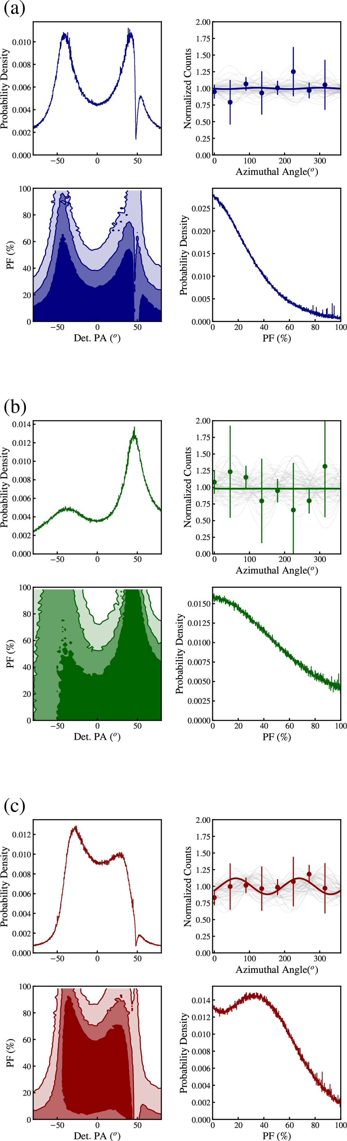
This figure shows the polarimetric analysis results. Each plot contains four subpanels: The top-left subpanel shows the posterior distribution of the PA in the detector plane (Det. PA); the top-right subpanel shows the best-fit modulation curve (solid line) together with 1000 randomly selected realizations from the MCMC simulations (gray lines); the bottom-left subpanel shows the joint posterior distribution of PF and Det. PA, with contours corresponding to the 68%, 95%, and 99% credible regions; and the bottom-right subpanel shows the posterior distribution of the PF. (a) Time-integrated case (T0 − 2 to T0 + 106 s; contours in navy blue). (b) Episode 1 (T0 − 2 to T0 + 38 s; contours in green). (c) Episode 2 (T0 + 77 to T0 + 106 s; contours in red).
Current usage metrics show cumulative count of Article Views (full-text article views including HTML views, PDF and ePub downloads, according to the available data) and Abstracts Views on Vision4Press platform.
Data correspond to usage on the plateform after 2015. The current usage metrics is available 48-96 hours after online publication and is updated daily on week days.
Initial download of the metrics may take a while.