


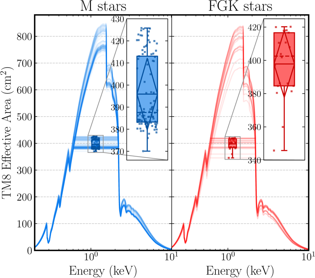
Fig. 3
Download original image
Comparison of effective area of TM8. The box plot represents the statistical distribution of the mean effective area over the 0.2-2.0 keV range. The solid horizontal lines within each box indicate the average value, while the dashed horizontal line (in the zoomed-in plot) represents the median. The sample includes all 103 M stars and 30 FGK stars used in this study.
Current usage metrics show cumulative count of Article Views (full-text article views including HTML views, PDF and ePub downloads, according to the available data) and Abstracts Views on Vision4Press platform.
Data correspond to usage on the plateform after 2015. The current usage metrics is available 48-96 hours after online publication and is updated daily on week days.
Initial download of the metrics may take a while.