Open Access
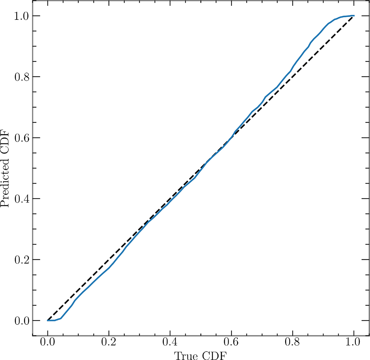
Fig. A.2.
Download original image
P-P plot of predicted chirp mass vs true chirp mass of simulated events. The black dashed line represents ideal situation with no bias, while blue line represents the pp curve of the algorithm. The distributions are similar to each other, with small bias occurring at the edges of the distribution.
Current usage metrics show cumulative count of Article Views (full-text article views including HTML views, PDF and ePub downloads, according to the available data) and Abstracts Views on Vision4Press platform.
Data correspond to usage on the plateform after 2015. The current usage metrics is available 48-96 hours after online publication and is updated daily on week days.
Initial download of the metrics may take a while.