Fig. B.1
Download original image
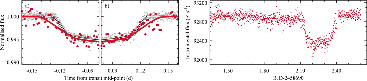
Transit of HD 332231 b in Sector 14. Panels a and b compare the Sector 14 transit light curve (red points) with the phase-folded data from other sectors (grey points), zoomed in on ingress and egress to highlight discrepancies. The corresponding best-fitting models are shown as red and black/white lines. Panel c shows the raw instrumental flux around the Sector 14 transit, illustrating systematics affecting the measurements.
Current usage metrics show cumulative count of Article Views (full-text article views including HTML views, PDF and ePub downloads, according to the available data) and Abstracts Views on Vision4Press platform.
Data correspond to usage on the plateform after 2015. The current usage metrics is available 48-96 hours after online publication and is updated daily on week days.
Initial download of the metrics may take a while.