Fig. 11
Download original image
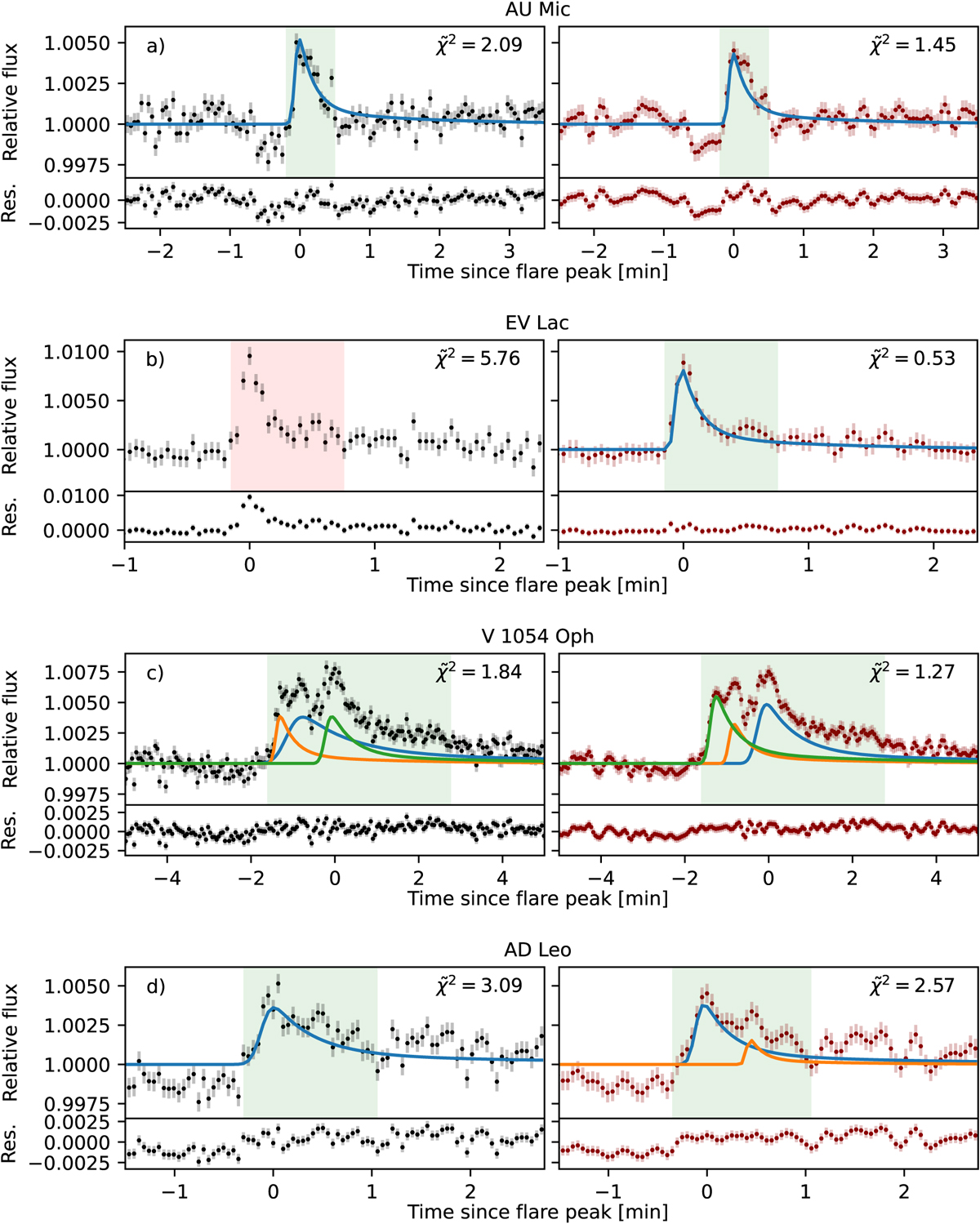
Comparison of the flare recovery before (left) and after (right) denoising. In each panel, the original light curve (black data points) is compared to the denoised light curve (red data points). The vertical bars indicate the photometric uncertainty associated with each flux measurement, as estimated during the photometry extraction. The star on which each event was detected is mentioned in the corresponding panel title. The green shaded areas correspond to the data points flagged as belonging to a flare candidate by the flare detection algorithm, and the red shaded areas correspond to a non-detection in the same portion of the light curve. The solid lines represent the fitted flare components. Below each light curve, we show the residuals after subtracting the best-fit flare model. In the top right corner of each panel, the ![]() calculated on the portion of the light curve we show is given as indication. Each panel group corresponds to a specific case: (a) Simple flare detected in the original and denoised light curves. (b) Simple flare detected only after denoising. (c) Complex flare with all components recovered in the original and denoised light curves. (d) Complex flare with an additional component recovered after denoising.
calculated on the portion of the light curve we show is given as indication. Each panel group corresponds to a specific case: (a) Simple flare detected in the original and denoised light curves. (b) Simple flare detected only after denoising. (c) Complex flare with all components recovered in the original and denoised light curves. (d) Complex flare with an additional component recovered after denoising.
Current usage metrics show cumulative count of Article Views (full-text article views including HTML views, PDF and ePub downloads, according to the available data) and Abstracts Views on Vision4Press platform.
Data correspond to usage on the plateform after 2015. The current usage metrics is available 48-96 hours after online publication and is updated daily on week days.
Initial download of the metrics may take a while.