Fig. C.1.
Download original image
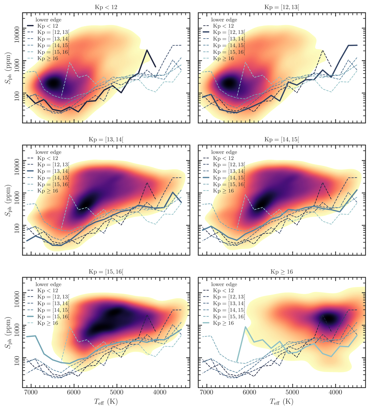
Density map for Sph as a function of Teff, where darker colors correspond to higher density (consistent with the color code in Fig. 3). Each panel corresponds to a different Kepler magnitude interval: from bright (top left) to faint (bottom right). The lines represent the lower edge (5th percentile) of the Sph distribution: solid line – the same magnitude of the density plot; dashed lines – other magnitude intervals, for reference. The color code of the lines also indicates the respective Kp.
Current usage metrics show cumulative count of Article Views (full-text article views including HTML views, PDF and ePub downloads, according to the available data) and Abstracts Views on Vision4Press platform.
Data correspond to usage on the plateform after 2015. The current usage metrics is available 48-96 hours after online publication and is updated daily on week days.
Initial download of the metrics may take a while.