Fig. 14.
Download original image
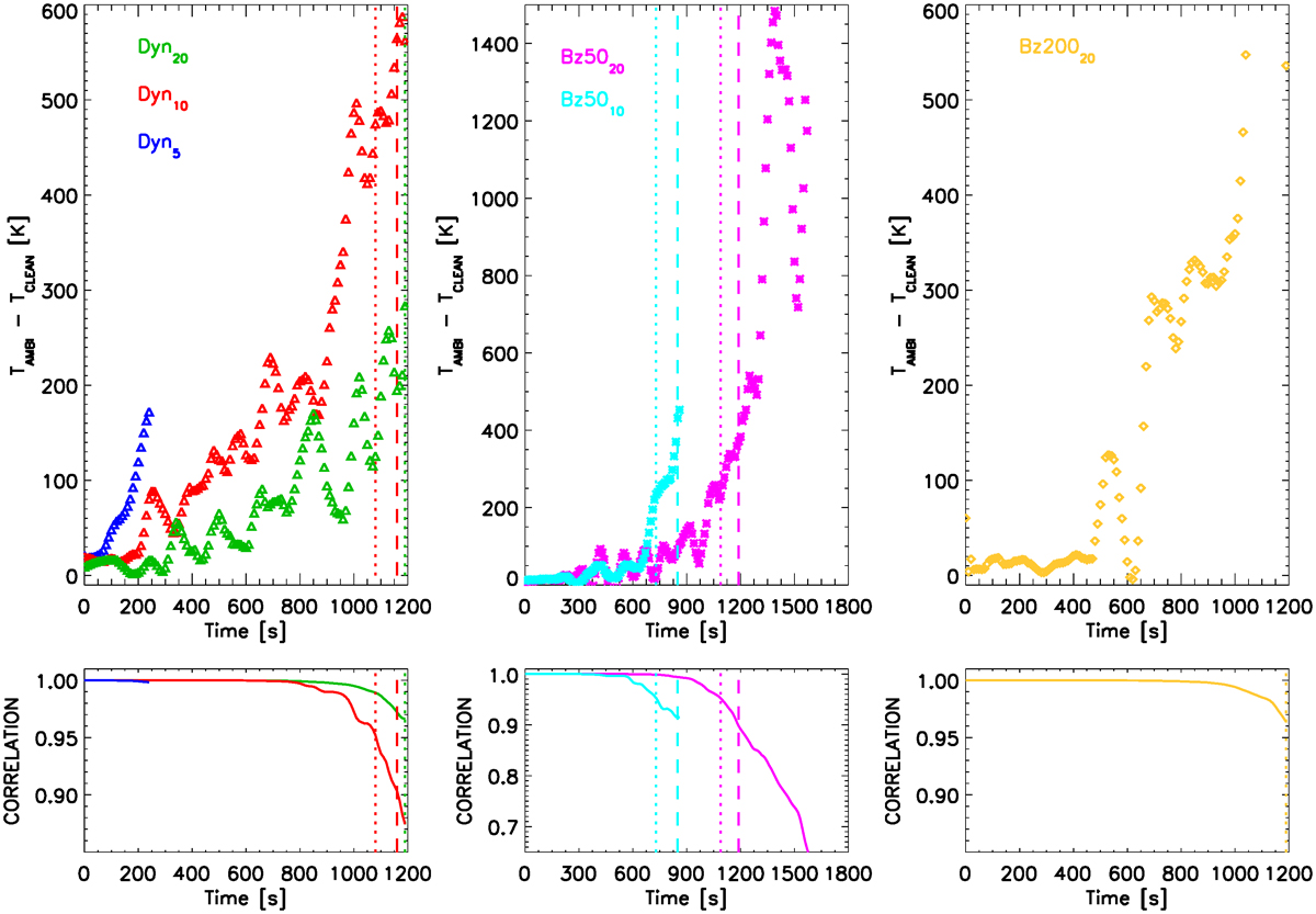
Top panels: Temperature difference between “ambi” and “clean” runs as a function of time. The temperature difference is averaged over heights where the percentage of points satisfying the criteria ![]() is at least 20% of the maximum number of points satisfying this criteria for a given model (as per Fig. 11). The curves are smoothed over five data points to decrease the scatter and better show the trends. Left: Dyn runs. Middle: Bz50 runs. Right: Bz200 run. Bottom panels: Correlation coefficient between temperature in the “ambi” and “clean” runs as a function of time. Vertical lines mark times where the correlation drops to 95% (dotted lines) and 90% (dashed lines), where appropriate. We note the difference in the axes range between the middle panels compared to the left and right panels.
is at least 20% of the maximum number of points satisfying this criteria for a given model (as per Fig. 11). The curves are smoothed over five data points to decrease the scatter and better show the trends. Left: Dyn runs. Middle: Bz50 runs. Right: Bz200 run. Bottom panels: Correlation coefficient between temperature in the “ambi” and “clean” runs as a function of time. Vertical lines mark times where the correlation drops to 95% (dotted lines) and 90% (dashed lines), where appropriate. We note the difference in the axes range between the middle panels compared to the left and right panels.
Current usage metrics show cumulative count of Article Views (full-text article views including HTML views, PDF and ePub downloads, according to the available data) and Abstracts Views on Vision4Press platform.
Data correspond to usage on the plateform after 2015. The current usage metrics is available 48-96 hours after online publication and is updated daily on week days.
Initial download of the metrics may take a while.