Fig. B.1
Download original image
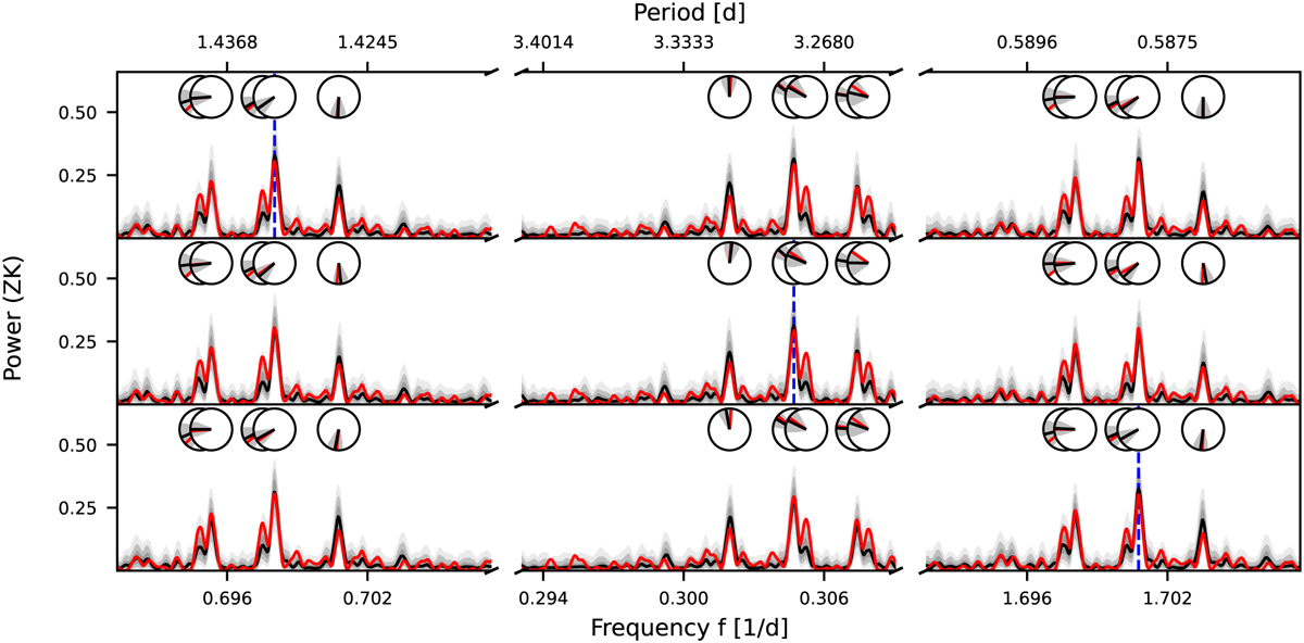
Alias test for G 268−110. Each row represents the result of simulating a different underlying period: first row: 1.43 d, second row: 3.28 d, third row: 0.59 d (each marked by the blue dashed line, respectively). The solid black line shows the median periodogram from 1000 simulations, with the interquartile ranges and the ranges of 90 % and 99 % denoted by the different gray-shaded areas. The observed periodogram is depicted by the red solid line. In addition to the periodograms, the resulting peak phases can also be compared in the circles above (the same colors as for the periodograms, but with the gray shade showing the standard deviation of the sampled peak phases).
Current usage metrics show cumulative count of Article Views (full-text article views including HTML views, PDF and ePub downloads, according to the available data) and Abstracts Views on Vision4Press platform.
Data correspond to usage on the plateform after 2015. The current usage metrics is available 48-96 hours after online publication and is updated daily on week days.
Initial download of the metrics may take a while.