Fig. 4.
Download original image
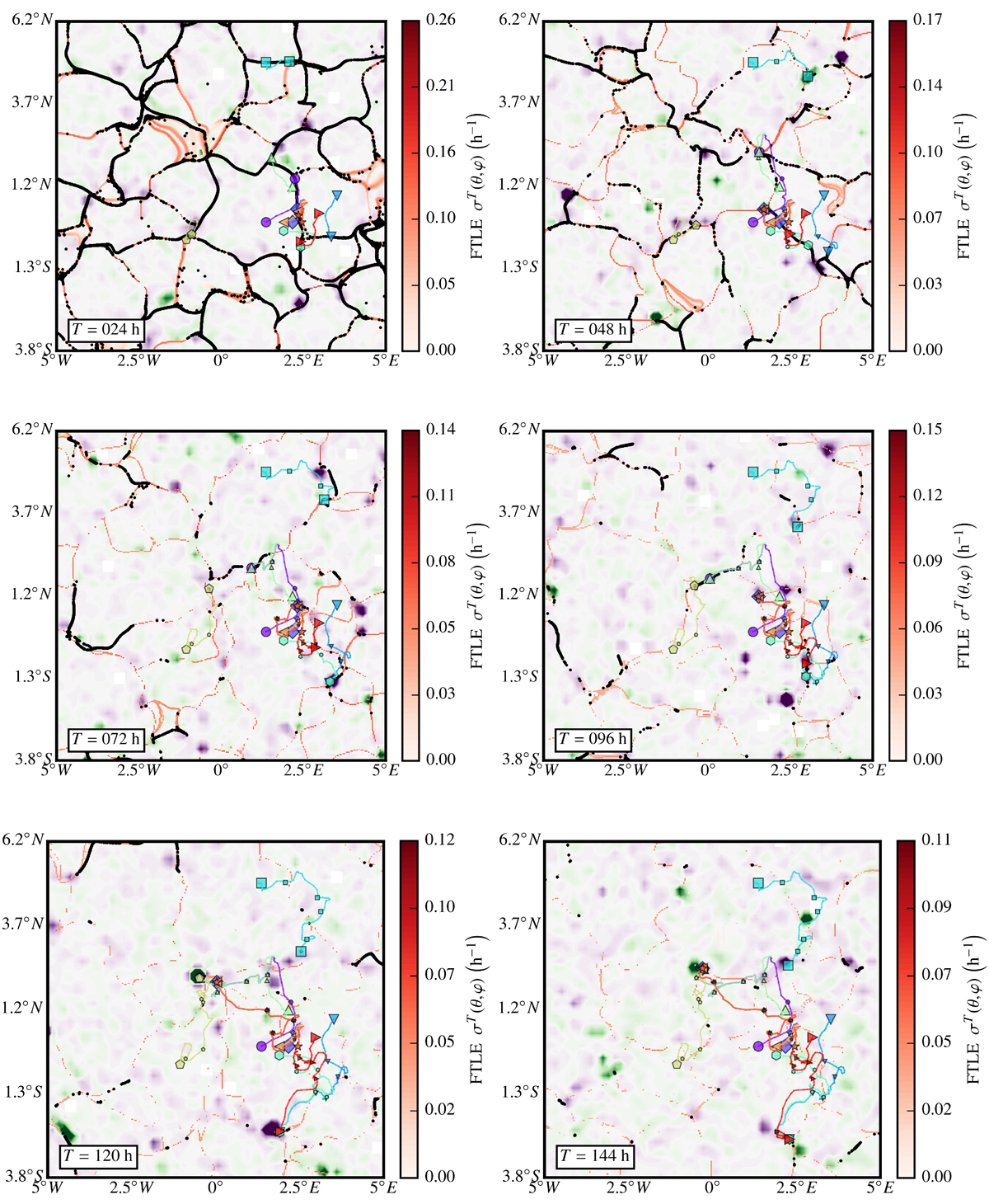
Continuation of Fig. 3. From top left to bottom right: zoomed-in region (frame in Fig. 3, left) showing attractive LCS calculated for successive negative tracer integration times (red colormap), superimposed with passive tracer locations (black dots) and corresponding local Bz magnetograms (same green/purple colormap as in Fig. 3) at corresponding positive integration times. As mentioned in Sect. 3, tracers accumulate in attractive LCS. Throughout the sequence, LCS and tracer concentrations correlate well with the magnetic network and bright points, respectively. The coloured markers and lines tag (positive-time) trajectories of a few selected tracers: large symbols mark the initial position and current position for the time of integration of each plot, and small symbols the position for every intermediate 24 h (see discussion in Sect. 5 and Fig. 7).
Current usage metrics show cumulative count of Article Views (full-text article views including HTML views, PDF and ePub downloads, according to the available data) and Abstracts Views on Vision4Press platform.
Data correspond to usage on the plateform after 2015. The current usage metrics is available 48-96 hours after online publication and is updated daily on week days.
Initial download of the metrics may take a while.