Fig. 16
Download original image
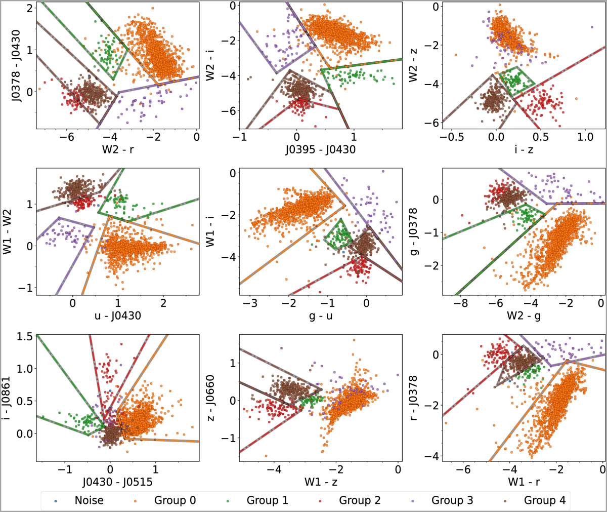
Examples of colour–colour diagrams using the top 20 features identified by the random forest model. These diagrams show the separation of different classes of objects from the Hα excess sources list. The selected diagrams illustrate effective clustering achieved through UMAP + HDBSCAN, highlighting key colours that contribute to classification. The coloured lines represent tentative colour cuts for separating different classes of Hα excess sources.
Current usage metrics show cumulative count of Article Views (full-text article views including HTML views, PDF and ePub downloads, according to the available data) and Abstracts Views on Vision4Press platform.
Data correspond to usage on the plateform after 2015. The current usage metrics is available 48-96 hours after online publication and is updated daily on week days.
Initial download of the metrics may take a while.