Fig. 5
Download original image
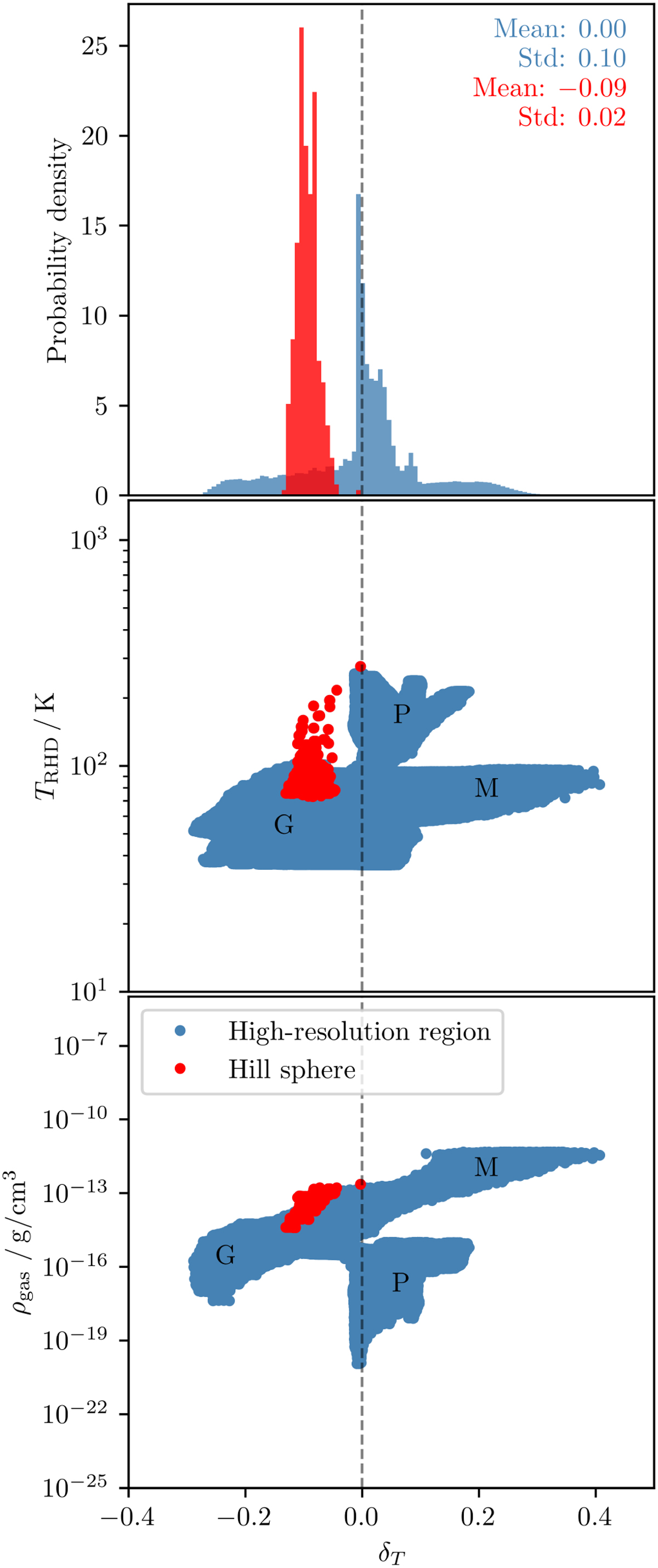
Relative temperature differences between RHD and MCRT simulations of the reference model. Top: normalized histogram. Center: Scatter plot for derived RHD temperatures and corresponding relative temperature differences. Bottom: Scatter plot for derived RHD gas densities and corresponding relative temperature differences. Data for the high-resolution (Hill) region is color coded in blue (red). The mean and std of the displayed distributions are indicated in the top-right corner. Labels in the scatter plots mark areas that roughly correspond to the following regions: the midplane (indicated by the letter “M”), the gap (“G”), and the photosphere and higher layers (“P”).
Current usage metrics show cumulative count of Article Views (full-text article views including HTML views, PDF and ePub downloads, according to the available data) and Abstracts Views on Vision4Press platform.
Data correspond to usage on the plateform after 2015. The current usage metrics is available 48-96 hours after online publication and is updated daily on week days.
Initial download of the metrics may take a while.