Fig. 3
Download original image
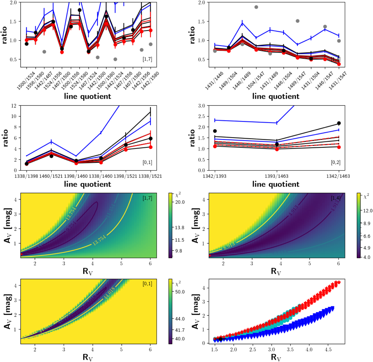
Determination of AV for TW Hya. We show the progressions as indicated in the lower or upper right corner of each panel. The top four panels show the measured and dereddened flux ratios (red dots) and the theoretical flux ratios (black dots if the ratio is used for the analysis, gray otherwise). Each black line corresponds to the curve defined by the dereddend measured ratios according to RV=3.1 and AV=0.0,0.5,1.0,1.5,3.0. The red and blue lines denote the same for RV=2.1 and 4.1 for AV=1.0 and 3.0, respectively (the vertical bars are the dereddened errors of the ratios). Three of the four lower panels show the corresponding contour plots of the best-fit models in the RV–AV plane. We show the 68%, 90%, and 95% confidence interval as a black, blue, and yellow line, respectively. The numbers in these lines state the C ~ χ2s for the respective confidence level and are also given in the color bar. The red dot marks the position of the minimum of the distribution. In the bottom right panel, we overplot the 180 best-fit Cs for every progression. Progression [1,7] is represented by cyan dots, progression [1,4] is represented by blue triangles, and progression [0,1] is represented by red stars. The black dot with error bars marks the central position and extent of the search box, and it marks the overall best RV – AV combination.
Current usage metrics show cumulative count of Article Views (full-text article views including HTML views, PDF and ePub downloads, according to the available data) and Abstracts Views on Vision4Press platform.
Data correspond to usage on the plateform after 2015. The current usage metrics is available 48-96 hours after online publication and is updated daily on week days.
Initial download of the metrics may take a while.