Fig. 1
Download original image
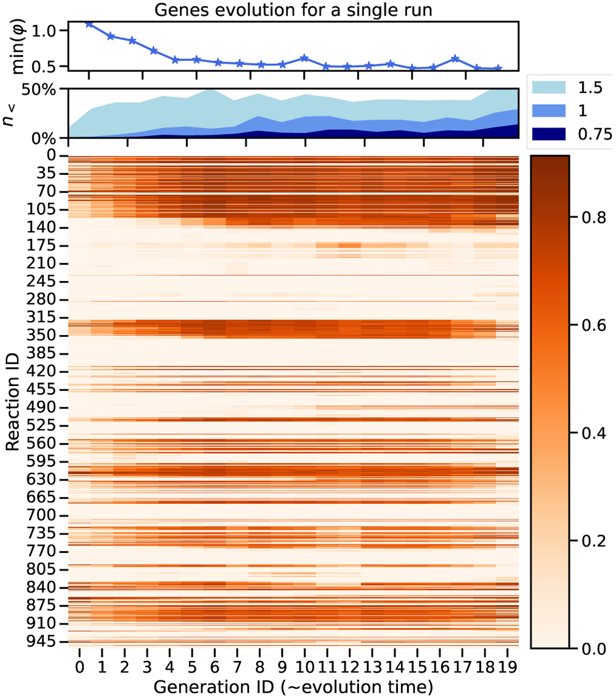
Example of DARWEN’s “evolution” during simultaneous optimization of two planets. Top: minimum of the loss function, φ, tracked across all schemes (or individuals) in each generation, showing the progress of optimization. Middle: proportion of individuals with a loss function below thresholds of 1.5, 1, and 0.75 per generation, providing insights into the population’s overall performance distribution. This visual indicates how many schemes consistently achieve high fitness levels. Bottom: Heatmap visualizing the average value of each gene across all individuals per generation. If all schemes possess a value of 1 for a specific gene, the heatmap is orange, whereas for 0 it appears white. This helps us evaluate the diversity within the population and how closely the schemes align with the PCA-based initial model. It also allows us to identify which types of reactions are most prevalent during the optimization process.
Current usage metrics show cumulative count of Article Views (full-text article views including HTML views, PDF and ePub downloads, according to the available data) and Abstracts Views on Vision4Press platform.
Data correspond to usage on the plateform after 2015. The current usage metrics is available 48-96 hours after online publication and is updated daily on week days.
Initial download of the metrics may take a while.