Fig. 2.
Download original image
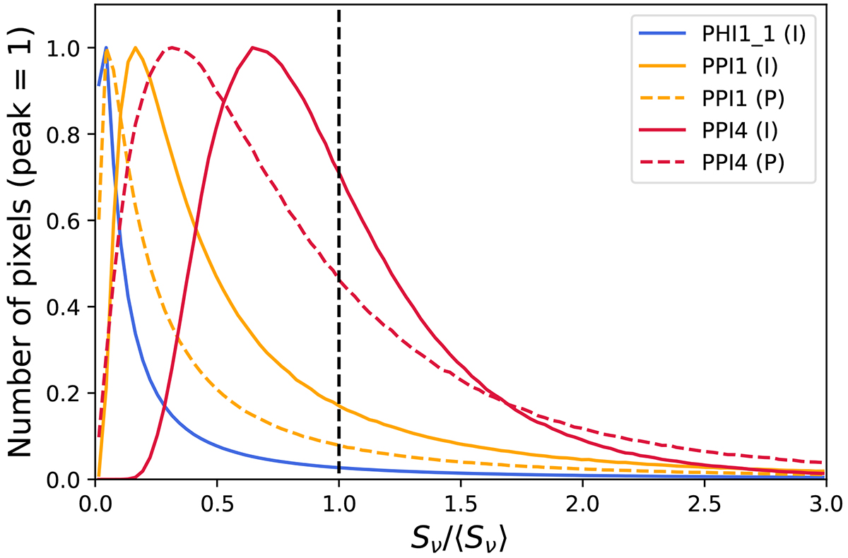
Histogram of pixel flux densities of our simulated PRIMAger maps in various bands (PHI1_1 in blue, PPI1 in orange, and PPI4 in red) in intensity I (solid lines) and polarization P (dashed lines). The x axis is normalized by mean of the map, while the y axis is normalized to unity at the peak. The vertical dashed line corresponds to the mean of the map.
Current usage metrics show cumulative count of Article Views (full-text article views including HTML views, PDF and ePub downloads, according to the available data) and Abstracts Views on Vision4Press platform.
Data correspond to usage on the plateform after 2015. The current usage metrics is available 48-96 hours after online publication and is updated daily on week days.
Initial download of the metrics may take a while.