Fig. 7.
Download original image
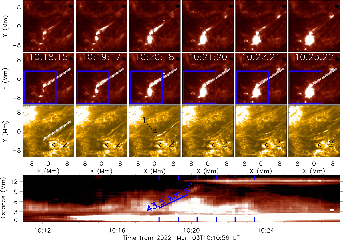
Evolution of the surge associated with the northernmost UV burst identified in Fig. 5 over the course of around 5 minutes. The top panel plots the IRIS SJI 1400 Å intensity, the second row plots the same but with a blue box indicating the FOV plotted in Fig. 5 and white lines indicating the pixels averaged over to create a time-distance diagram overlaid, whilst the third row plots the co-spatial and co-temporal HRIEUV intensity. The white lines overlaid on the first column of the third row are exactly co-spatial to the white lines overlaid on the first column of the second row, whilst the black arrows indicate the locations of the two surges related to the northernmost (‘1’) and central (‘2’) UV bursts studied here. The bottom panel plots a time-distance diagram constructed using IRIS SJI Si IV 1400 Å data at the pixels identified by the white lines on the second row. The six blue markers at the top and bottom indicate the time-steps plotted above. The extension of the surge is highlighted by the diagonal blue line that has a gradient of 43.5 km s−1. A movie more clearly displaying the evolution of this region (combined with Fig. 8) is included with the online version of this article.
Current usage metrics show cumulative count of Article Views (full-text article views including HTML views, PDF and ePub downloads, according to the available data) and Abstracts Views on Vision4Press platform.
Data correspond to usage on the plateform after 2015. The current usage metrics is available 48-96 hours after online publication and is updated daily on week days.
Initial download of the metrics may take a while.