Fig. 9
Download original image
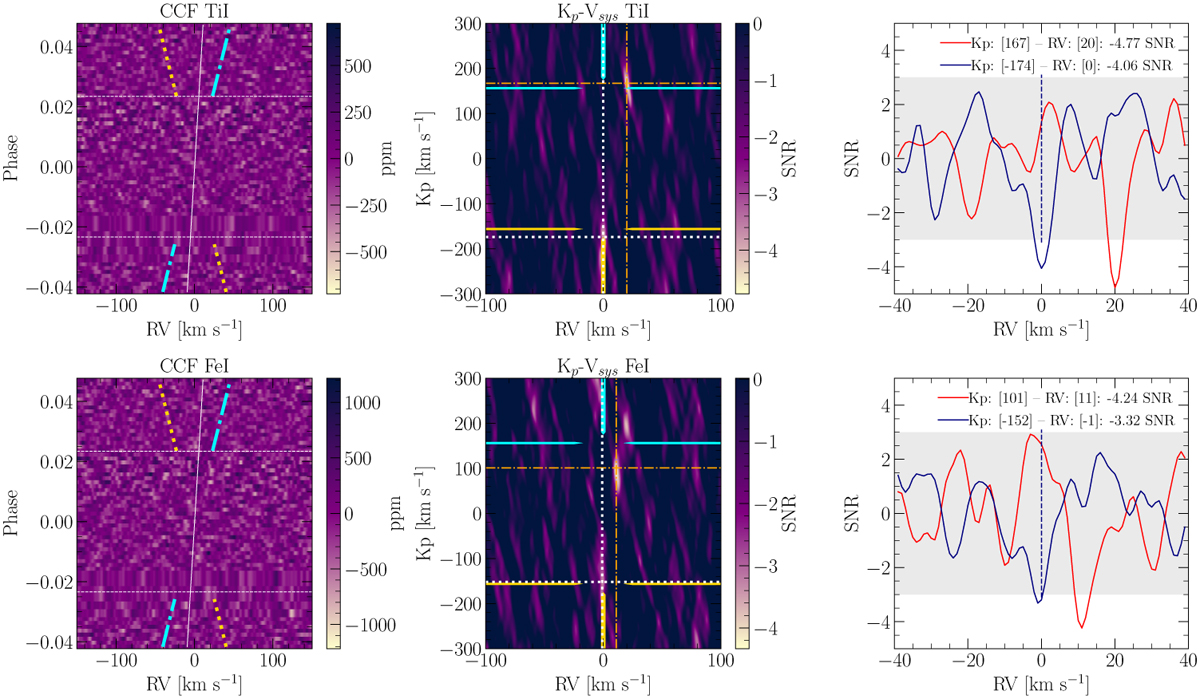
CCF (left) and Kp–Vsys (center) maps for Ti I and Fe I. The horizontal white lines in CCF maps correspond to the T1 and T4 contact points, while the cyan dash dotted and gold dotted lines mark the expected planetary Kp and -Kp of the injected signals, respectively. The white slanted line corresponds to the Doppler shadow curve. Cyan and gold arrows in Kp–Vsys maps point toward Kp and -Kp , respectively. Orange dash dotted and white dotted pointers point toward the minimum value of the maps between RV [−40, +40] km s−1, Kp [100,200] km s−1and that between RV [−40, +40] km s−1, Kp [−200, −100] km s−1, respectively. The red and navy lines in the last column are the 1D projection of the Kp– Vsys maps evaluated at the minima found around the theoretical and injected Kp .
Current usage metrics show cumulative count of Article Views (full-text article views including HTML views, PDF and ePub downloads, according to the available data) and Abstracts Views on Vision4Press platform.
Data correspond to usage on the plateform after 2015. The current usage metrics is available 48-96 hours after online publication and is updated daily on week days.
Initial download of the metrics may take a while.