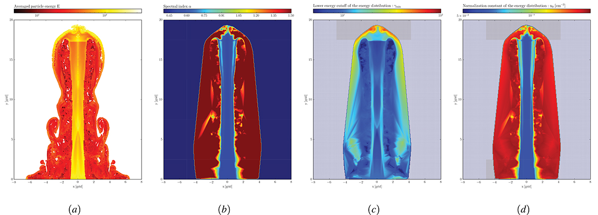
Fig. 4.
Download original image
From left to right: Demonstration of our synthetic imaging pipeline. All panels show a 2D slice through our 3D jet simulations. The pipeline starts to extract the particle population from the underlying fluid (see Fig. 3). The particle population in panel (a) is color-coded by dimensionless averaged particle energy. Brighter colors (white and yellow) represent higher energies, i.e., the case for the inner jet spine. The recollimation shock, associated with a centralized region of higher energy, is visible in the jet’s spine. The particles are “cooled” by radiative losses (orange and red) and cool even more rapidly when leaving the jet flow. Panels (b)–(d) illustrate the interpolated particle values that form a grid of particle attributes (highest values in red): Panel (b) shows a 3D grid of the spectral index, α, calculated from the spectrum’s slope, s, of the energetic changes due to radiative losses at a given frequency. Panel (c) highlights the lower energy cutoff, γmin, of the particle’s energy distribution. Panel (d) shows the calculated normalization constant, Ne, of the energy distribution interpolated onto a 3D grid.
Current usage metrics show cumulative count of Article Views (full-text article views including HTML views, PDF and ePub downloads, according to the available data) and Abstracts Views on Vision4Press platform.
Data correspond to usage on the plateform after 2015. The current usage metrics is available 48-96 hours after online publication and is updated daily on week days.
Initial download of the metrics may take a while.