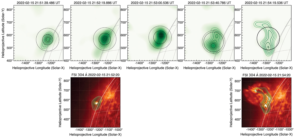
Fig. 6.
Download original image
Time evolution of the X-ray 4–10 keV source during the peak of the X-ray emission. The top panel shows the STIX images reconstructed using the CLEAN algorithm with a 30 s time integration. The green colour map and green contours show the CLEAN intensity maps, scaled to the peak flux, and the contours show the 40–100% levels. The black circle marks the FWHM of the FWDFIT-reconstructed maps over the same time intervals, and the dashed black circle marks the 180″ limit. The corresponding EUI/FSI maps for the two time intervals for which observations are available are plotted below, with the STIX contours over-plotted on top. To over-plot these STIX images on the corresponding EUI/FSI maps, the contours were over-plotted using the ‘SphericalScreen’ context manager available through the sunpy package. For the right-most panel, the STIX contours are shifted by (40″, 20″) to better align with the EUV emission based on the brightest sources.
Current usage metrics show cumulative count of Article Views (full-text article views including HTML views, PDF and ePub downloads, according to the available data) and Abstracts Views on Vision4Press platform.
Data correspond to usage on the plateform after 2015. The current usage metrics is available 48-96 hours after online publication and is updated daily on week days.
Initial download of the metrics may take a while.