Fig. 3.
Download original image
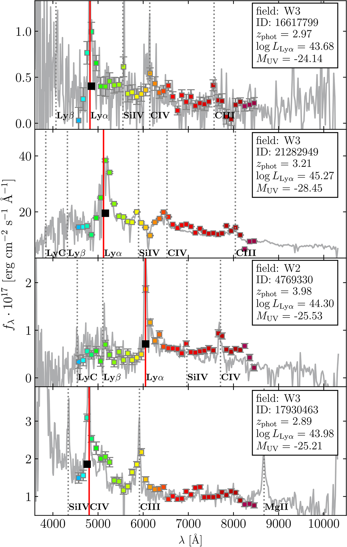
Four examples of candidates selected by our pipeline. The colored squares represent the NB fluxes of PAUS. We compare with the SDSS spectrum in gray (resampled by a factor 10 to reduce visual noise). We mark the most important QSO emission lines (dotted gray vertical lines) and the predicted observed wavelength of Lyα by our selection pipeline (vertical red line). The estimation of the continuum level is marked with a black square. The first three panels are examples of correctly selected Lyα emitters. The last panel is an example of a confusion between Lyα and C IV (![]() ), the most common source of contamination.
), the most common source of contamination.
Current usage metrics show cumulative count of Article Views (full-text article views including HTML views, PDF and ePub downloads, according to the available data) and Abstracts Views on Vision4Press platform.
Data correspond to usage on the plateform after 2015. The current usage metrics is available 48-96 hours after online publication and is updated daily on week days.
Initial download of the metrics may take a while.