Fig. 7.
Download original image
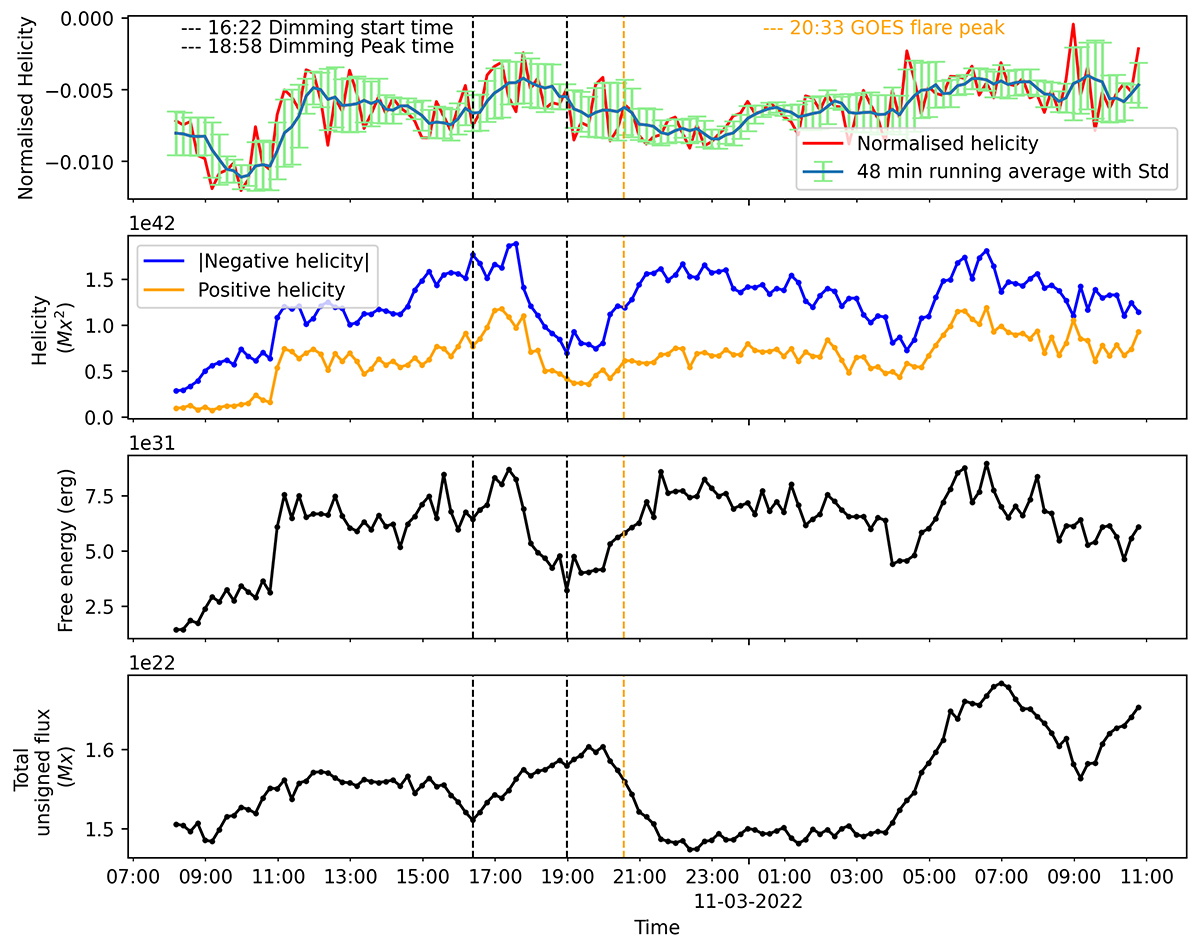
Temporal evolution of other magnetic attributes of NOAA AR 12962. Top to bottom: a) The red curve is the normalized helicity value. The blue overplotted curve and the green error bar correspond to the 48-minute moving average and the standard deviation, respectively. b) The blue line represents instantaneous normalised negative helicity, and the orange line represents the normalized positive helicity. c) The black line represents the normalized instantaneous magnetic free energy. d) The black line represents the instantaneous total unsigned flux. In all panels, the vertically dashed black lines indicate the dimming start time (16:22) and dimming peak time (18:58), and the dashed orange line represents the GOES flare peak time.
Current usage metrics show cumulative count of Article Views (full-text article views including HTML views, PDF and ePub downloads, according to the available data) and Abstracts Views on Vision4Press platform.
Data correspond to usage on the plateform after 2015. The current usage metrics is available 48-96 hours after online publication and is updated daily on week days.
Initial download of the metrics may take a while.