Fig. 6.
Download original image
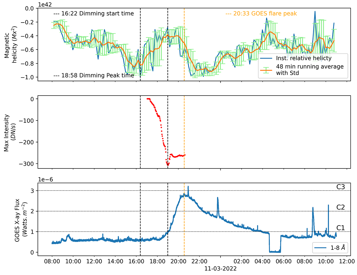
Temporal evolution of magnetic properties of NOAA AR 12962. Top to bottom: a) Blue lines represent the instantaneous values of the relative magnetic helicity estimated from the CB method. The over-plotted orange curve and green error bars are the running averages of the estimated values over a 48-minute window, with the standard deviation of each 48-minute moving average, respectively. b) Red dots represent the base difference intensity of the darkest region within the dimming. c) The blue curve represents GOES 1–8 Å X-ray flux 1-minute data. In all panels, vertically dashed black lines indicate the dimming start and peak time, and the orange line represents the GOES flare peak time.
Current usage metrics show cumulative count of Article Views (full-text article views including HTML views, PDF and ePub downloads, according to the available data) and Abstracts Views on Vision4Press platform.
Data correspond to usage on the plateform after 2015. The current usage metrics is available 48-96 hours after online publication and is updated daily on week days.
Initial download of the metrics may take a while.