Fig. 3
Download original image
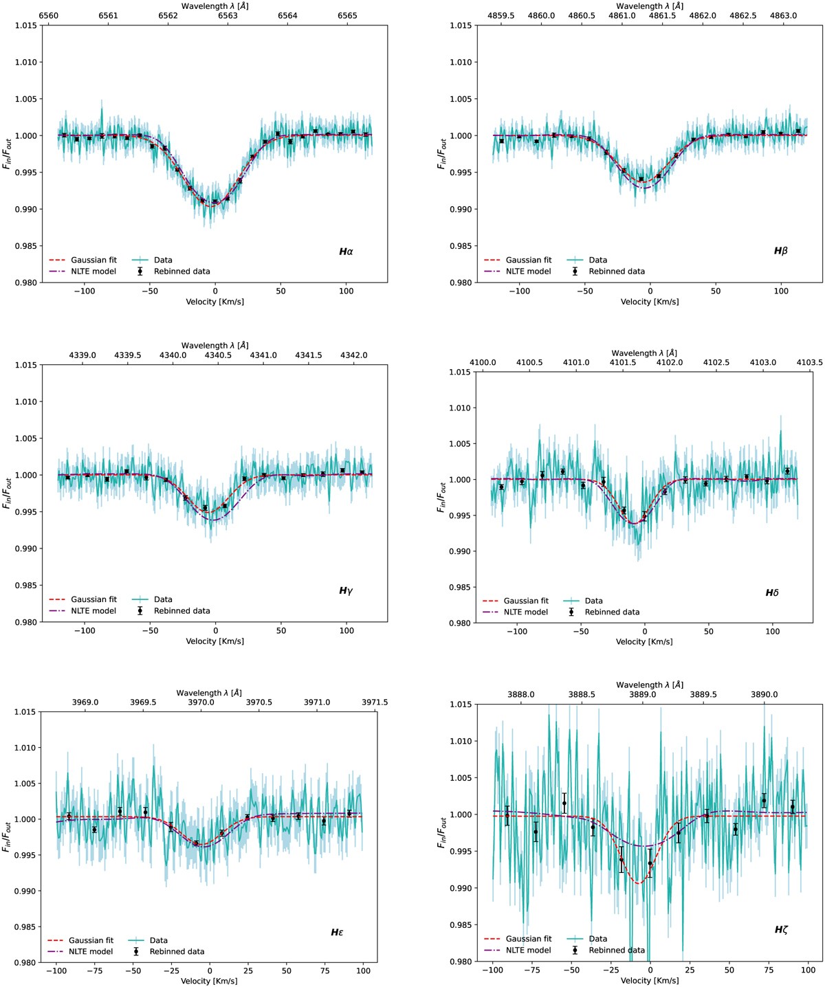
Balmer series transmission spectra: all the figures have the same range on the y axis to underline the differences between the single lines. The dashed red lines represent the Gaussian best fit, the results of which are listed in Table 3, while the black dots are for a 20× binning. Hζ presents a wider scatter compared to the other lines due to the low S/N in the bluest part of the HARPS-N range. The purple lines show the NLTE broadened models discussed in Section 5. The small gradient of the NLTE model for Hϵ is due to the vicinity with the Ca H line at 3968.47 Å.
Current usage metrics show cumulative count of Article Views (full-text article views including HTML views, PDF and ePub downloads, according to the available data) and Abstracts Views on Vision4Press platform.
Data correspond to usage on the plateform after 2015. The current usage metrics is available 48-96 hours after online publication and is updated daily on week days.
Initial download of the metrics may take a while.