Fig. 10.
Download original image
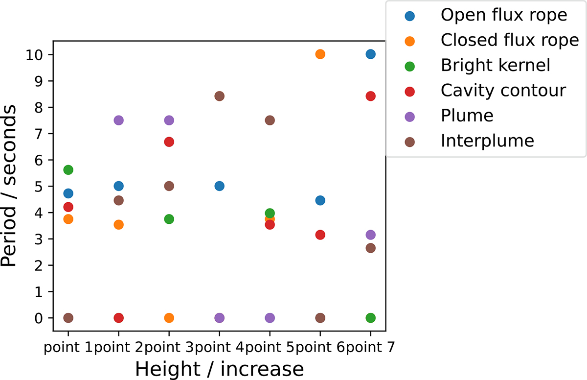
Scatter of the wavelet analysis results along characteristic paths of the corona. The wavelet analysis quasi-periodic peak scatter plots for all feature points on the six selected paths are shown in this figure. The X-axis represents the height from the bottom layer of the corona along the path. We note that each of the six paths has seven sample points, and their heights on the X-axis may not be consistent. In this figure, we have plotted the heights of the seven sample points together for comparison. The Y-axis represents the quasi-periodic peak value; a period value of zero indicates that the quasi-periodic peak was not detected at the sample point.
Current usage metrics show cumulative count of Article Views (full-text article views including HTML views, PDF and ePub downloads, according to the available data) and Abstracts Views on Vision4Press platform.
Data correspond to usage on the plateform after 2015. The current usage metrics is available 48-96 hours after online publication and is updated daily on week days.
Initial download of the metrics may take a while.