Fig. 9.
Download original image
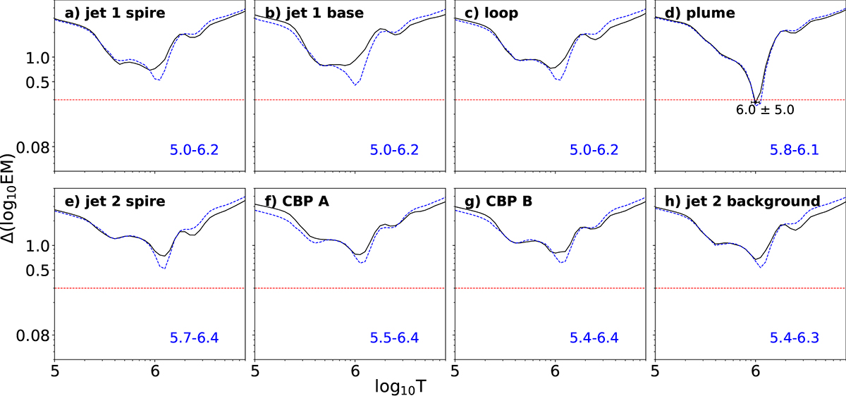
The Δlog10 EM curves for the two areas. Temperature is measured in K. The top row corresponds to jet 1, showing results for the jet spire (panel a), the jet base (panel b), a region on the loop (panel c), and the plume emission (panel d) at 17:27 UT. The bottom row corresponds to jet 2, showing the spire (panel e), two regions on the coronal bright point (A and B in panels f and g, respectively), and the background (panel h) at 17:08 UT. The red dashed horizontal line at 0.3 represents the net uncertainty due to calibration errors, photometric errors, and so on (see text for more details). In panel d, we annotate the temperature logarithm corresponding to the minima ΔEM, as well as the logarithm of the temperature error. Here, 6.0 ± 5.0 is a representation denoting 1.0 × 106.0 ± 1.0 × 105.0 K. The blue dashed lines correspond to the synthetic Δlog10 EM curves derived from the simple rectangular DEM distributions. The logarithmic temperature range of the DEM distribution for each region is shown in blue in the bottom-right corner.
Current usage metrics show cumulative count of Article Views (full-text article views including HTML views, PDF and ePub downloads, according to the available data) and Abstracts Views on Vision4Press platform.
Data correspond to usage on the plateform after 2015. The current usage metrics is available 48-96 hours after online publication and is updated daily on week days.
Initial download of the metrics may take a while.