Fig. 4
Download original image
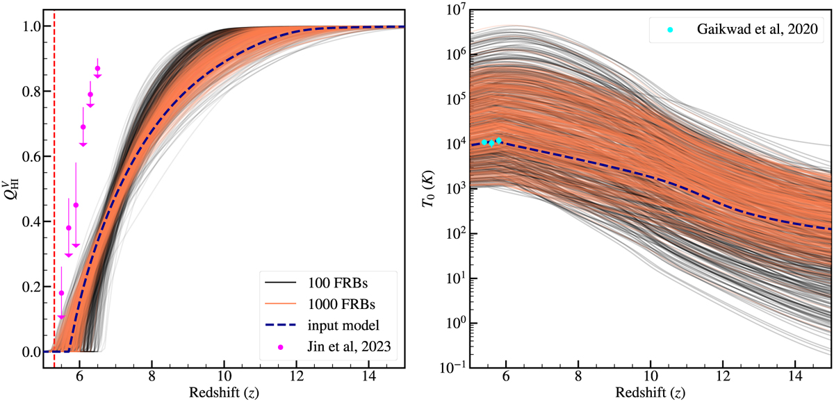
Plots of 500 random models from the posterior chains for two different sets of FRB mocks (with 100: black; with 1000: orange). In the left panel, we show the evolution of the neutral hydrogen fraction with redshift. The vertical dashed red line represents our hard prior on the end of reionization at ɀ = 5.3. In the right panel, we show the mean IGM temperature evolution. Although we did not use any other observational constraints while exploring the parameter space, we show some of the existing observational estimates to facilitate comparison. The left magenta points represent the recent upper limits on the neutral fraction from Jin et al. (2023). The right cyan points show the constraints on the mean IGM temperature using the Ly-a forest spike statistics study (Gaikwad et al. 2020). The dashed blue line represents the input reionization model used to generate the FRB mocks.
Current usage metrics show cumulative count of Article Views (full-text article views including HTML views, PDF and ePub downloads, according to the available data) and Abstracts Views on Vision4Press platform.
Data correspond to usage on the plateform after 2015. The current usage metrics is available 48-96 hours after online publication and is updated daily on week days.
Initial download of the metrics may take a while.