Fig. 1
Download original image
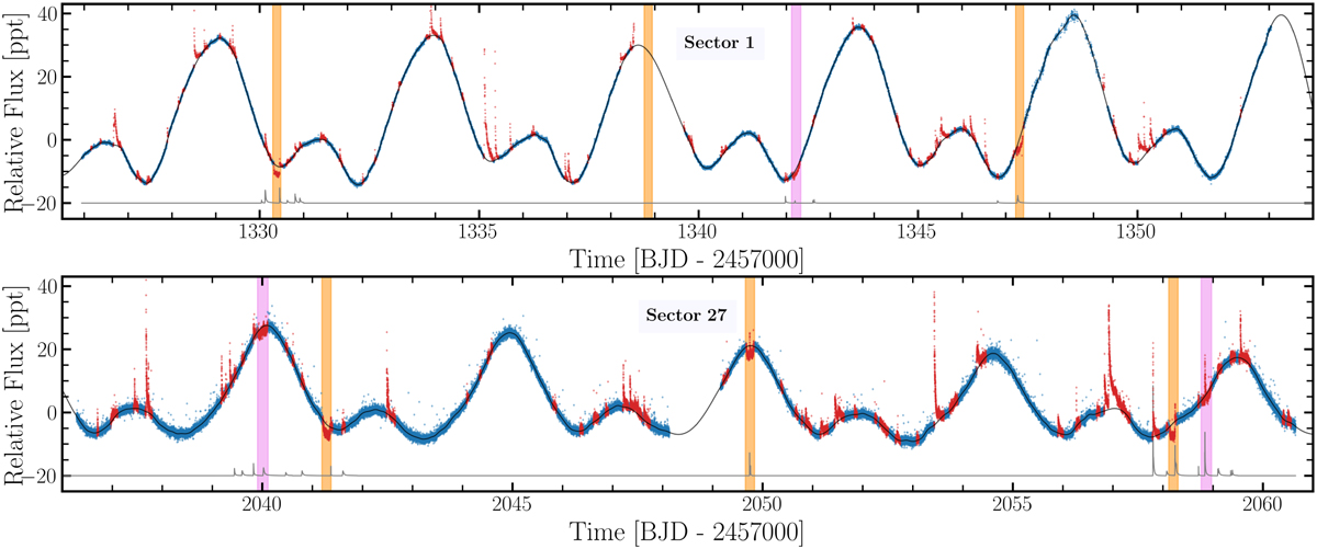
TESS light curve of AU Mic. The PDCSAP flux used in the analysis is shown as blue dots. The data considered as flares or transits are shown as red dots. The black and grey lines represent the stellar activity models for the stellar rotation and for the flares, respectively. The flare model was vertical shifted for a better visualisation. The vertical orange and purple bands indicate the timing of the planetary transits for AU Mic b and c, respectively.
Current usage metrics show cumulative count of Article Views (full-text article views including HTML views, PDF and ePub downloads, according to the available data) and Abstracts Views on Vision4Press platform.
Data correspond to usage on the plateform after 2015. The current usage metrics is available 48-96 hours after online publication and is updated daily on week days.
Initial download of the metrics may take a while.